.png)
There’s no doubt about it—the world is going mobile.
Google decided earlier this year to begin rolling out mobile-first indexing. eCommerce is now turning into mCommerce, and brands with a mobile app report that 67% of sales happen in-app. It seems that for every action we used to do on desktop, there’s now an easier, faster way to do it from our phones.
Most of us now are mobile app users, but it takes a lot to become a mobile app maker. If you’re about to launch a mobile app, you may find that your users are suddenly not the ones you were expecting.
Today’s mobile users are more complicated than ever. They’re busy, they’re impatient, they’re unpredictable, and they’re not going to cut you any slack—and yes, many of them are millennials.
Mobile apps come with their own strengths and their own requirements, and mobile users with their own needs and preferences.

How can you adapt to these needs? How can you keep your mobile users happily tapping away? How do you know that your users are happy?
The bad news is that there’s no easy answer for this, because each user and audience is different and will respond differently to your app. Many mobile app professionals find themselves struggling to answer these questions, and have to guess their way through every decision.
The good news is that there are a few good user happiness guidelines you can follow, and best of all, you can track them to see how well you’re doing.
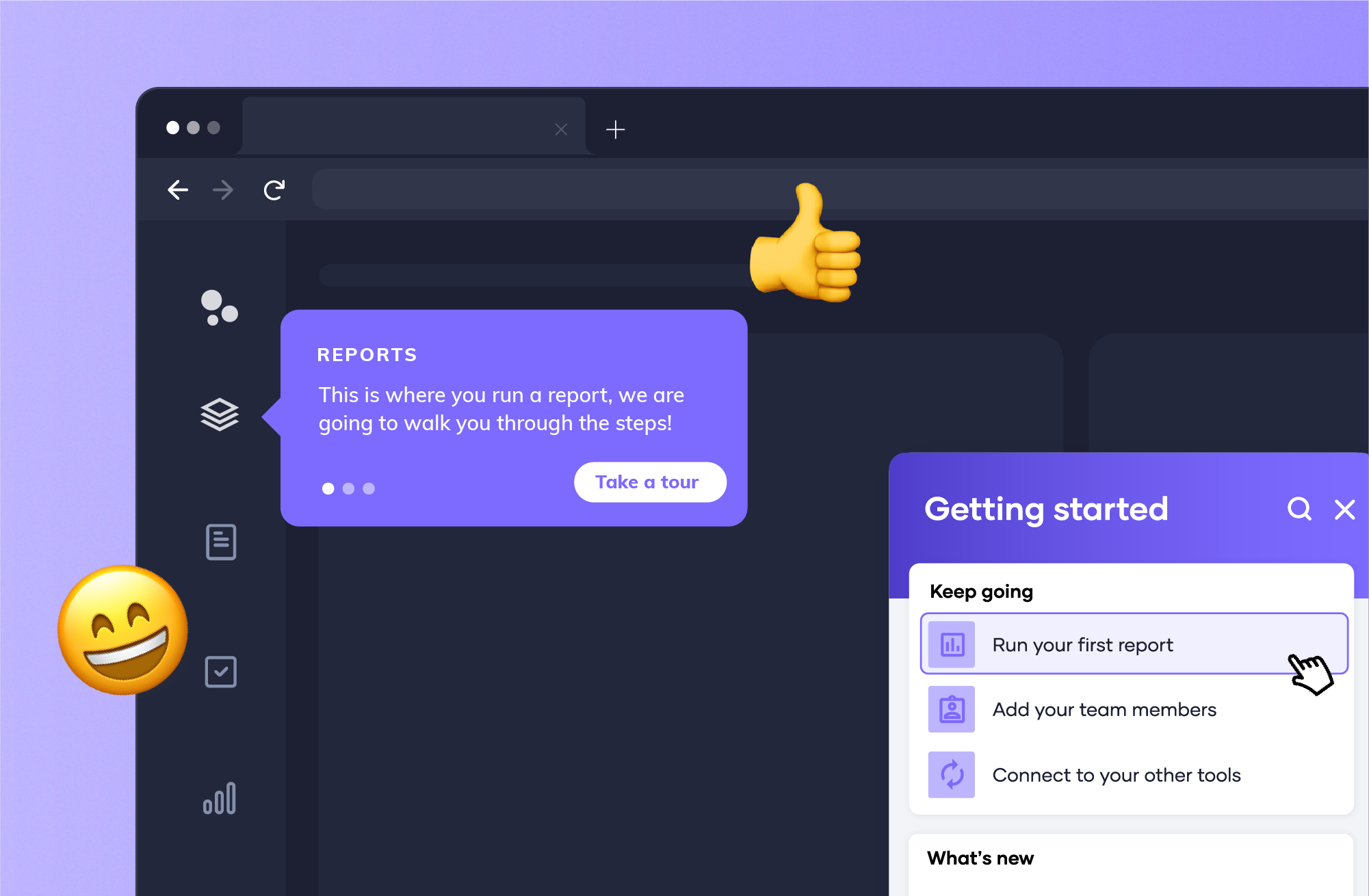
Here are 4 guidelines for mobile app professionals who place user happiness as a top priority. Follow these tips to stay focused on your users, encourage them to try out your app, and give them enough reasons to stay.

Onboarding is like a first date—you only have one chance to make a good first impression, and one wrong move or bad joke can make the person you’ve just met decide to ghost you.
Well, you don’t want users ghosting your app, right? We don’t either. That’s why the most important time users spend in your app is the first time(s) they use it. Users generally decide to continue using—or dump—an app in the first 3-8 days of using it.
Onboarding is a crucial process for app professionals to get right: no bugs, no crashes, no usability problems allowed. In addition, it must be quick and efficient, so that users can get rolling with the app as fast as possible. Users already know what to expect in the app they just downloaded, and they’ll know instantly whether or not your app has that. The faster they get to using your app and fulfilling their needs, the better—that way they will keep coming back for more and tell their friends about it.
How do you know that your onboarding process isn’t sending your users away? One oft-overlooked tool is action cohorts, a visual that shows the relation between one event in the app and another.
For example, you can set a filter to see how many users signed up for the app and then went on to complete a purchase in the same week. This approach gives you more actionable insights about every single action of your onboarding—more than simply looking at retention and acquisition rates.

The gestures users make in apps are more complicated than the clicks on a website or desktop app. The good news is that they reveal much more about the way users interact with your mobile app, enabling you to know what they are trying to do and why.
Here’s an example: Imagine an app with a screen that requires login before users can proceed A lot of users were failing to complete the login funnel—something that may be explained by a number of reasons, such as a bug in the code or a password error.
However, by learning more about the users’ gestures on the screen, it’s easy to see that they were trying to swipe in order to bypass the login screen and see what the app contains—meaning it might be a good idea to allow them a “sneak peek” without forcing them to log in.
How do you find that out?
By using the magic of qualitative analytics, specifically touch heatmaps.
Touch heatmaps are a great way to get deep insights with just a quick glance. What they do is show a map of the aggregate gestures users made on each screen of your app, so that you can see where users are touching the screen most. As you can see in Appsee’s touch heatmaps feature, you should also be able to filter the heatmaps by type, and even view the unresponsive gestures that might be ruining your users’ experience.
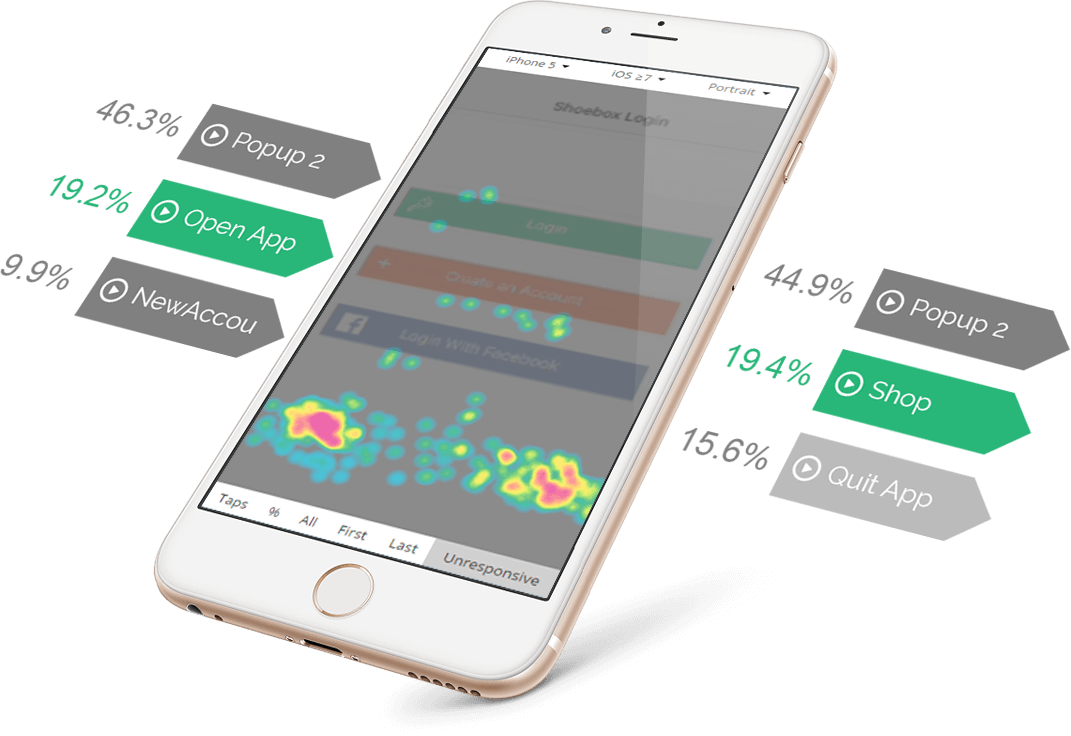
What are unresponsive gestures? These are some of the most frustrating things users encounter in mobile apps: the user taps or swipes the screen, expecting it to behave in a certain logical way, and it...doesn’t.
Unresponsive gestures often lead to the “rage clicks” of mobile: a user becomes so frustrated with the app’s interface that they angrily tap-tap-tap-tap-tap on the screen. What's usually their next move?
You guessed it, they quit the app forever. As horrible as that sounds, touch heatmaps can help you take care of the problem quickly and painlessly, by hunting them down for you and telling you where they’re hiding.

One of the greatest differences between mobile users and desktop users is the way their eyes move. Desktop users move their eyes across the screen, side-to-side and up and down, looking for the information they want. Mobile users only look in one direction. They will either swipe or scroll through each screen and they won’t have the patience to look for the right button, link, or filter. They need to have every relevant element shown to them at all times, at just a quick glance.
What does this mean for you? Keep content short and sweet, and avoid UI practices that make reading on a small screen harder to do, such as columns of text or lengths of text that demand scrolling until your fingers get numb.
Pro tip: “Murder your darlings”. If a line or a paragraph isn’t 100% necessary or useful, show no mercy and cut it. UX copy is a vital part of app design, and it has the power to make your users fall in love with every aspect of your app, from the first onboarding screen to an error message.
How do you polish your app’s copy until it shines? One good approach is A/B testing, which allows you to compare how well users respond to two possible iterations of a text. A/B testing your mobile app copy is especially important, since you have to squeeze a lot of meaning into just a few words and you have only one chance to get it right.
Mobile users are usually doing whatever they’re doing in a bit of a rush. They’re on the subway, they’re just about to start a meeting, or they need to do a few errands before going to bed. You’ll want to give them exactly what they need, exactly when and where they need it.
How do you ensure that?
Personalize.
App personalization is the practice of automatically adapting your app to individual users, by analyzing their data. Personalization can mean anything from wishing the user “good morning” when they launch the app early in the day, to displaying shopping suggestions based on previous purchases or showing events based on location.
Any time you automatically give your users a personalized experience, you’re saving them time and effort—and yes, even the few seconds it might take to use a filter or answer a few questions matters.
App personalization has been a hot topic for a while, and users have come to expect apps to give them the content they require—even when they don’t have the same needs as other users.
So how do you assess whether your personalization efforts are paying off? Well, probably the best way to ensure that you’re really understanding your users is to actually watch them—not by leaning over their shoulder, but by viewing user session recordings.
A feature of qualitative analytics, these are recordings of actual user sessions, filtered so that you can pick the ones most relevant to what you’re investigating. By looking at session recordings, which also show a breakdown of the actions users took, you can see exactly how they experience your app, and then make their experience even better.
If you're about to launch your first mobile app, you're about to meet a new type of user: one with less time, less screen space, and a much shorter attention span. How do you keep these users happy, and how do you keep your app installed on their phone?
The first golden rule is: Don't waste their time. Unnecessary features, long texts, and heavy onboarding funnels will make them run for the hills, or for your competitors. An efficient, personalized experience will encourage users to stay and make your app a part of their routine in some way, increasing your retention rates.
Happy users = happy KPIs!


.png)