.png)

We're all about helping companies create better user experience (UX) design. That's why we've spent a lot (seriously, a lot) of time looking at other companies' UX strategies - the good, the bad, and the ugly - to understand what makes for memorable, enjoyable user experiences.
Here's the thing most teams get wrong about UX: they treat it like a visual design problem. A prettier dashboard. A cleaner layout. But the UX examples that actually move metrics have nothing to do with aesthetics and everything to do with motivation. Good UX design doesn't just point users in the right direction - it gives them a reason to take the next step.
We broke down 12 real-world onboarding examples and beyond across four stages of the user journey - onboarding, conversion, feature adoption, and amplification - to show you exactly what's working and why.
Good UX design removes friction and motivates action at every stage of the user journey. Bad UX prioritizes aesthetics over usability - it looks polished but leaves users confused about what to do next.
The difference shows up fast in your metrics. Products with strong UX design activate more users and keep them longer. Products with weak UX bleed users at every transition point.
All 12 examples below share a common thread: they reduce cognitive load and guide users toward a clear next step. Whether it's a personalized onboarding quiz or a well-timed upsell prompt, following onboarding best practices and smart UX design patterns make the desired action feel like the obvious choice.
The user onboarding experience is one of the first steps in the user journey and can make or break the future of a user's relationship with your product. It's also one of the most action-heavy stages; users need to put in the effort to realize value, so it's one of the most important stages to optimize.
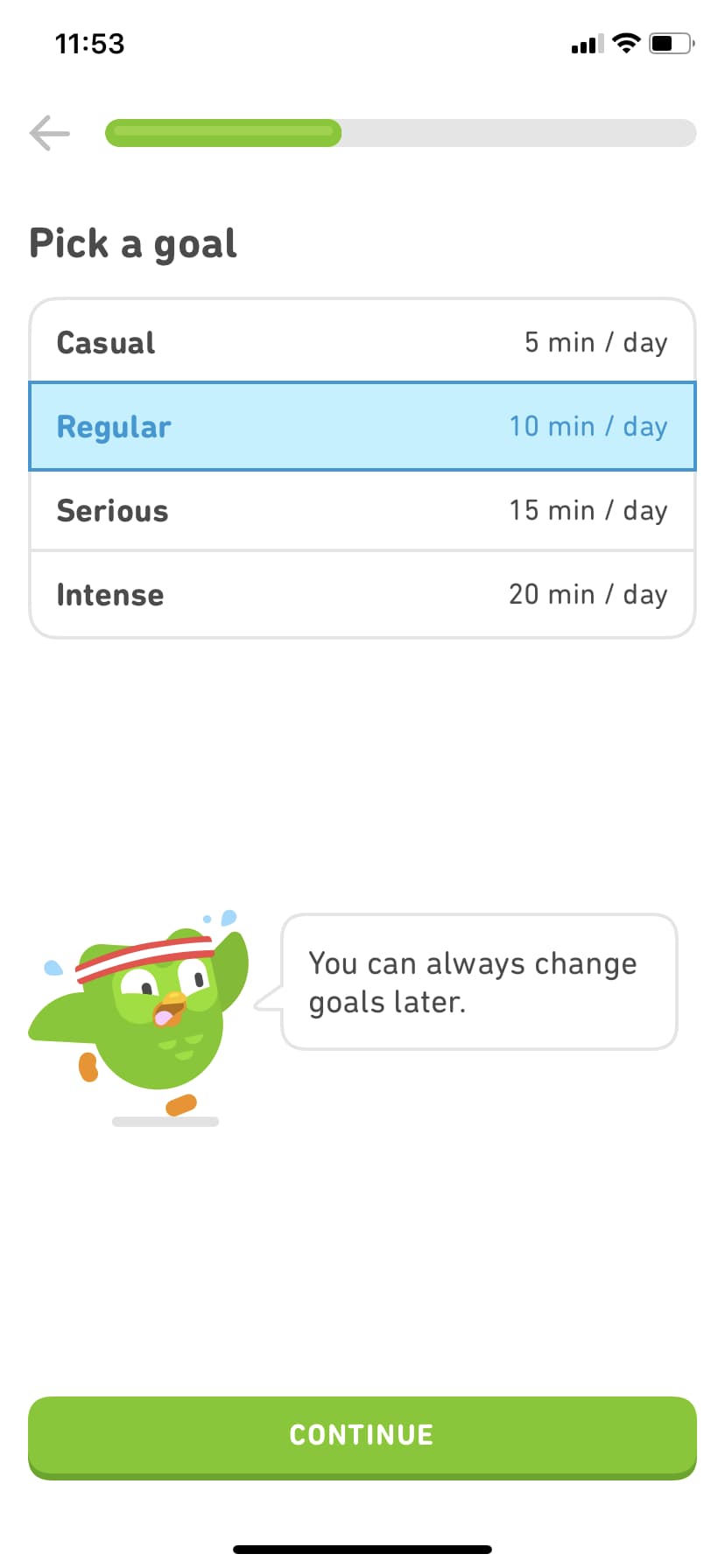
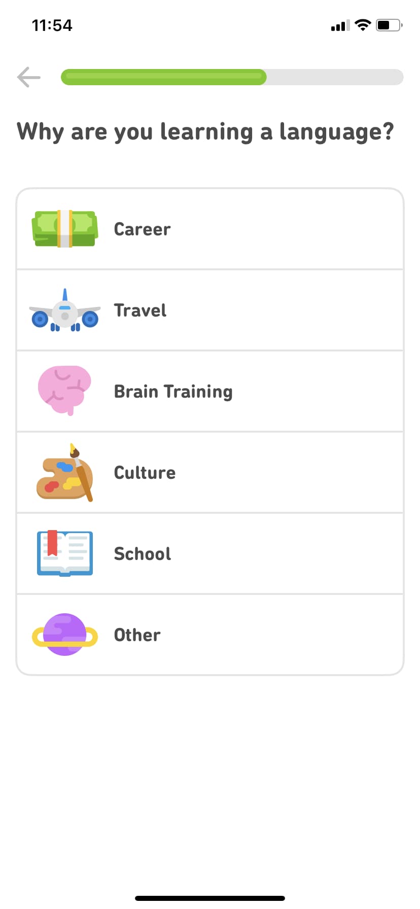
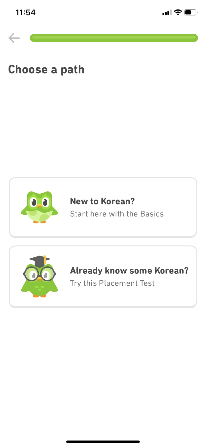
Duolingo is a language-learning app that offers lessons for every level of expertise. So how do they meet the needs of such a diverse learner base? It all starts with their persona-based user experience - a masterclass in product personalization.
A friendly owl mascot and round, approachable typography welcome users into a quick quiz that tailors the experience to each user's goals and level of knowledge. With this context, Duolingo curates custom lessons and guides the user to what is most immediately valuable to them. Users jump right into lessons that match their expertise and goals - so they realize value immediately. Duolingo has grown to over 100 million monthly active users, and this personalized first experience is a key reason why retention stays high.
Rather than trying to cover every persona in a single experience, take the time to tailor the journey to the individual user for better onboarding outcomes.
Why it works: Personalization at the very first touchpoint makes users feel understood, which builds trust before they've even started learning.
Canva takes a different approach to onboarding. Instead of front-loading a tutorial that most users will skip, Canva uses tooltips and contextual guidance to teach users at the exact moment they need help.
When a user first clicks on a text element, Canva surfaces formatting options right there. When they hover over an unfamiliar tool, a tooltip explains what it does and how to use it. The result is an onboarding experience that feels invisible - users learn by doing rather than by watching a walkthrough they'll forget in minutes.
This contextual approach reduces cognitive load significantly. Users aren't asked to absorb a product's full feature set upfront. They discover capabilities naturally as they work toward their first creation. With over 200 million monthly active users, Canva's learn-by-doing approach has proven that reducing upfront onboarding friction directly correlates with adoption at scale.
Why it works: Contextual guidance meets users where they are instead of where you think they should be. It turns the entire product into the onboarding experience.
If you have a lot of video content on your website, it can really load up your servers. This is where Wistia, a third-party video hosting platform, comes in.
Wistia has a great onboarding flow, but users don't always have a video readily available for upload. To help minimize churn, Wistia gives users the option to "borrow" a test video or create one on the spot. It's a small design choice with big impact - onboarding flows that remove blockers like this can improve completion rates by 20% or more, according to Wistia's own product team.
If your onboarding requires users to upload a file, make sure you have alternatives like these to prevent people from abandoning your product early on. (Psst - check out our User Onboarding guide for creating more memorable product experiences.

Asking people to pay for your product can be tricky. If you don't get it right, it can actually turn users off your product.
People are bound to hesitate before punching in their credit card number, no matter how positive their experience with your freemium product has been. When it comes to upgrading, when and how you ask matters. Here are a few companies doing it right:
Slack is a communication platform for business teams that centralizes messaging, files, and external app integrations into a single workspace.
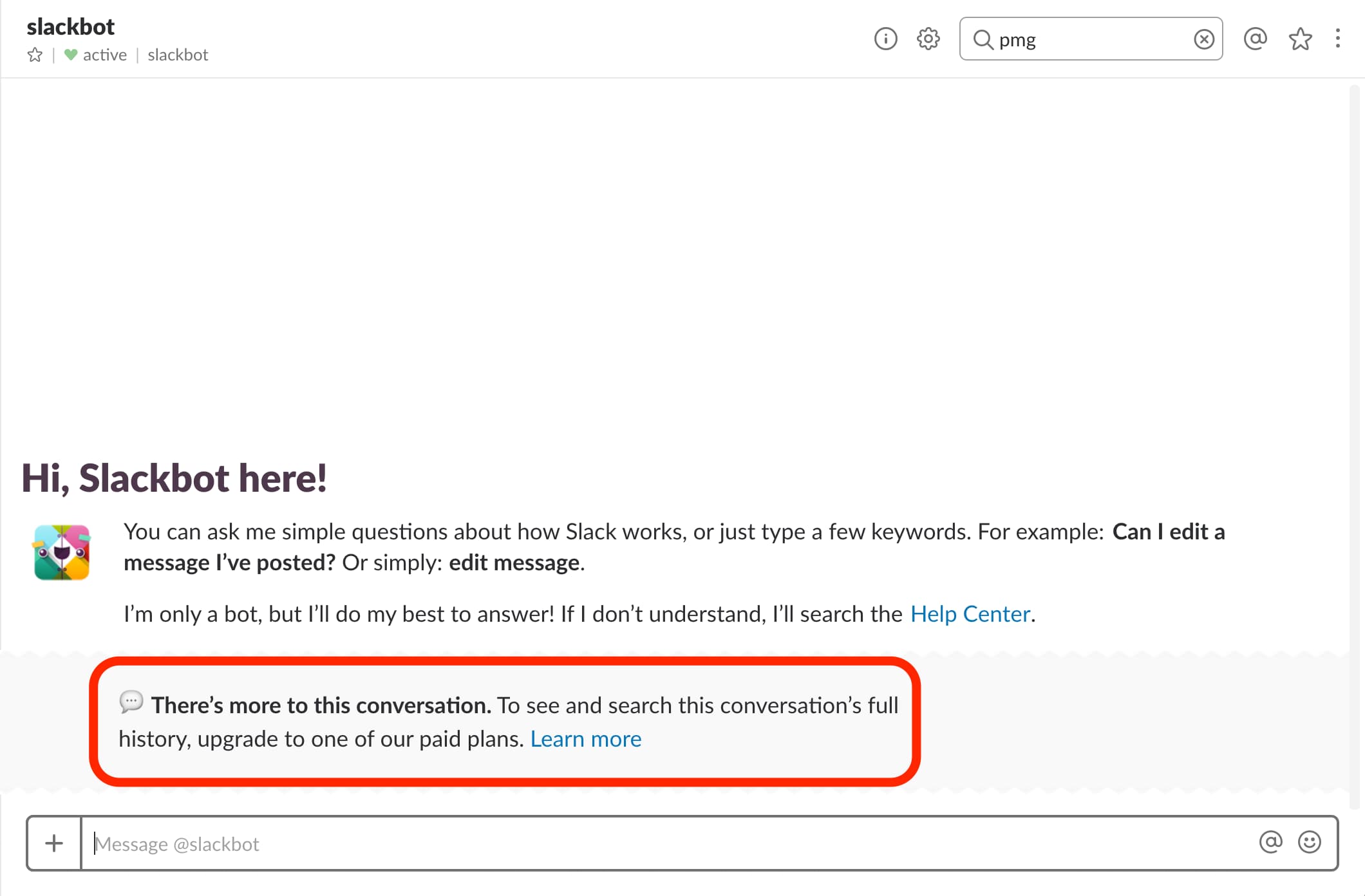
While Slack offers a free version, their premium plan is where they make their money. Rather than making the hard sell right out of the gate, Slack lets users experience the full suite of features for free - with usage limits. The free plan caps workspaces at 10k messages, 5GB of files, or 10 third-party app integrations. By the time users hit those limits, they're already hooked on the platform.
Slack has converted millions of free teams to paid plans using this approach. The key: they insert upsells at the exact moment a user encounters a limitation. When someone searches for a message outside the 10,000 most recent, Slack prompts them to "learn more" about premium. When they scroll past accessible messages in a conversation, Slack offers to unlock the rest by upgrading.
Conversion is all about the right place and right time. Think about what crossroads your users will reach during their journey and how you can prove value at each step - so upgrading feels like an obvious choice, not a hard sell.
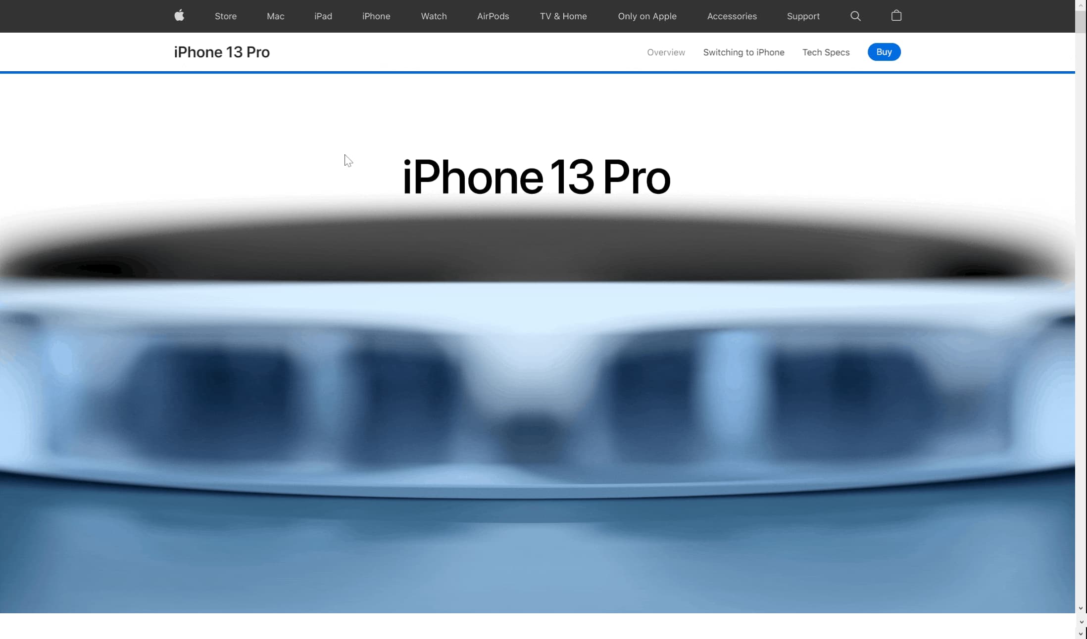
Apple has always excelled at visual product immersion, and their iPhone product pages are a masterclass in the approach. The immersive web design experience makes each feature tangible for the user, and bold statements in modern typography make the user feel like they're buying into something exclusive.
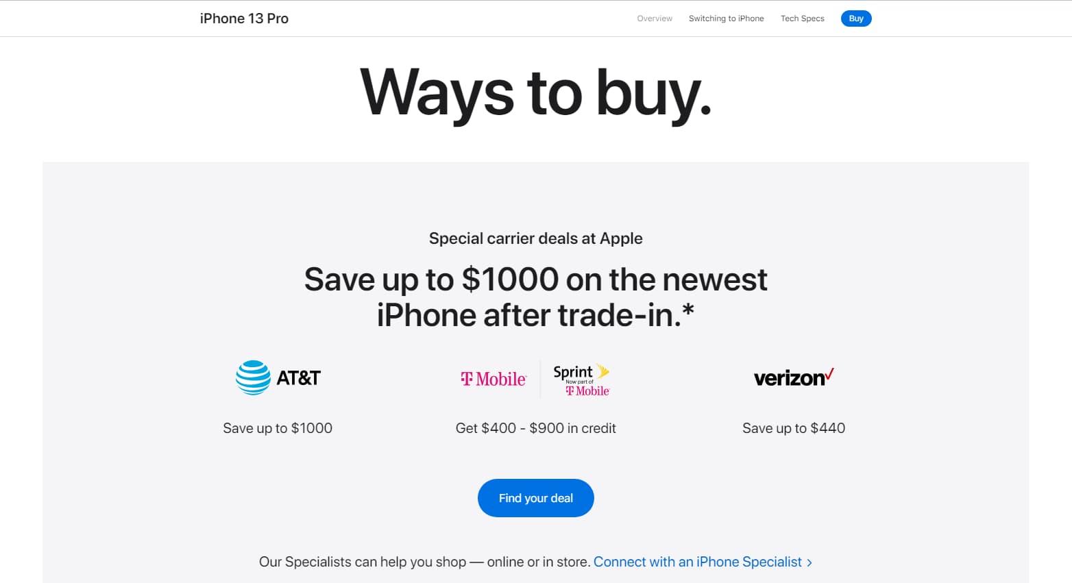
While a small "Buy" CTA button floats at the top of the page, the full sell doesn't occur until the very bottom - after the user has been fully immersed in sleek animations showcasing each feature. By that point, the user is primed and ready to act.
This pattern is consistent across Apple's product lineup and has been for years. The principle is timeless: help your users experience the value of your product before asking them to take the leap. The longer users spend immersed in the experience, the more confident they feel hitting "buy."
While a small "Buy" CTA button floats at the top of the page, a full sell for the product doesn't occur until the very bottom; this appears after the user has been fully immersed in sleek animations of each feature. By this point, the user is primed and ready to hit the “find your deal” button.
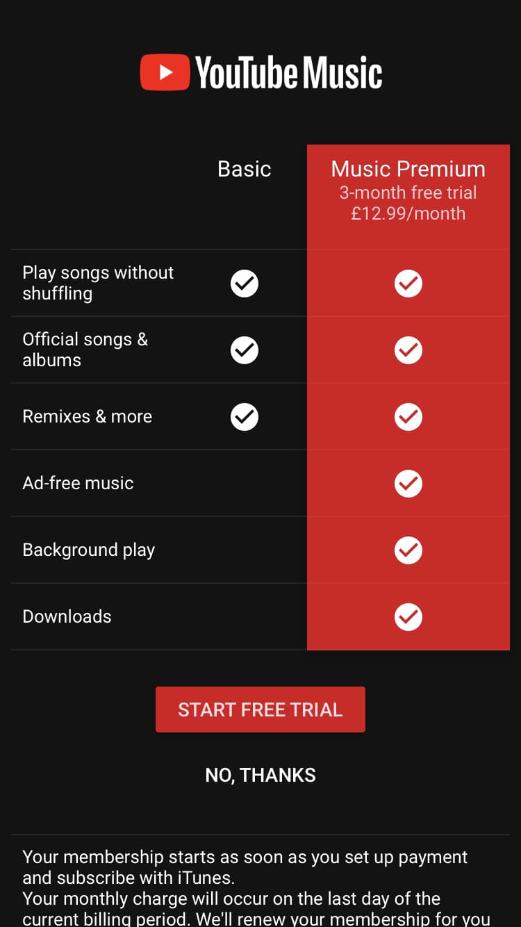
YouTube Music, a streaming service developed by the well-known video platform, makes upgrading an easy choice for users. YT Music uses a simple comparison chart to show users what they'll get out of a premium version and an option to experience the value firsthand for three months, free.
The bright red naturally draws the user's eye to the benefits of premium, and a CTA button in the same color makes selecting this option clear.
The lesson here: don't underestimate the power of simplicity. Don't leave users wondering what they'll get out of upgrading - tell them exactly what they can expect and make your value clear.
Updating or introducing new features can help keep a product feeling fresh and relevant. Rolling out a new feature can bring new users onto your platform, reduce churn from existing customers, and provide incentives to upgrade.
New feature announcements should strike a balance between being exciting and remaining unobtrusive. You want to let your users know about your feature update without disrupting their normal workflow. This way, users can explore your new feature on their own terms.
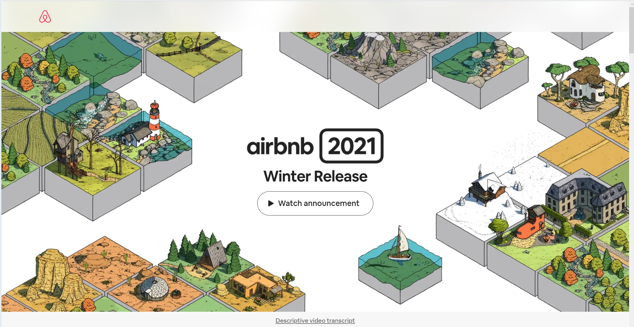
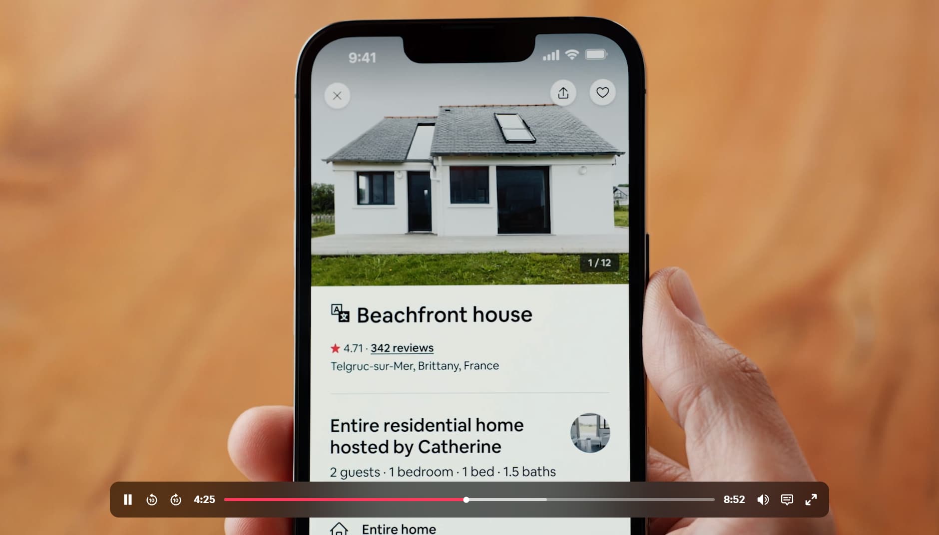
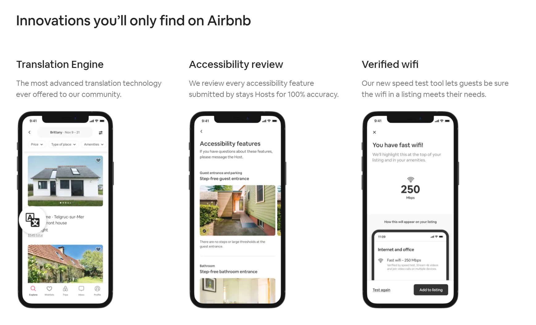
Airbnb put the emphasis on excitement by launching a dedicated homepage for their Winter Update, which included 50+ new features.
The most notable part of the page is the opening graphic illustration with a CTA that opens a captivating video. The video builds a narrative around the update, so users feel a personal connection rather than feeling like they're reading a laundry list of new features. Airbnb cofounder Brian Chesky walks users through each piece of the update, adding a human element that reinforces trust and usability.
The pattern is timeless: if your team is launching a bunch of new features at once, make it an event. Give the launch a dedicated space so it doesn't interfere with the usability of your overall product, and build a narrative rather than just a feature dump.
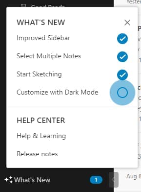
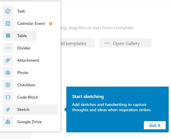
Evernote pioneered a proven pattern for feature announcements: an interactive "What's New" sidebar with pulsing hotspots and easy-to-follow checklists. This approach gives users visual motivation to review each new feature while remaining unobtrusive to the main workflow - even minor updates that might otherwise be missed entirely get surfaced.
Once the user clicks on a new feature, a tooltip pops up to quickly identify it and give them more details on how to use it.
This design pattern has become a standard across SaaS products for good reason. Especially when announcing minor updates, make it easy for users to identify and use new features with clear visual indicators to follow.
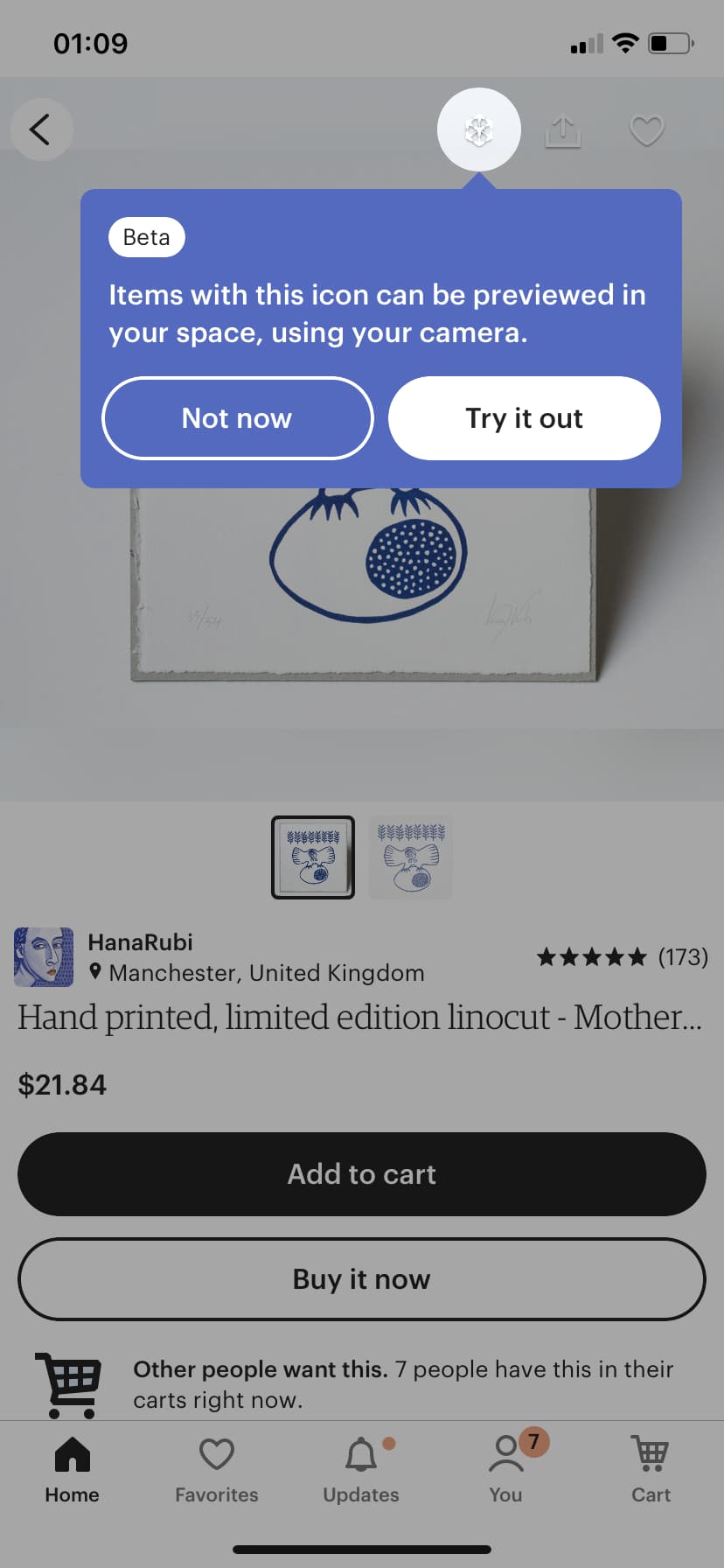
The handmade and vintage ecommerce store Etsy highlighted their new AR experience on mobile by putting a literal spotlight on it. The feature could have otherwise been easily missed because users weren't familiar with the AR icon, but with the spotlight on it, it's hard to miss. Etsy also put a corresponding tooltip in place to give users a brief description of what the feature does and large CTA buttons to make the feature easy to engage with.
New feature announcements don't always have to be complex, but they do start and end with the user in mind. Make new features easy to understand and apply for your users.
The real test of a loyal user is if they're willing to promote your brand. It's a delicate ask - now more than ever, users want to use and promote brands that don't just solve their pain points but also align with their values. In other words, you're asking them to go beyond spending money on your product to actually putting their own personal "brand" on the line for yours.
If you can get users to share your product, though, it's incredibly valuable. Word-of-mouth referrals are not only effective but also generate highly qualified leads. A good ask should be clear, fluid, and offer the user some value in return.
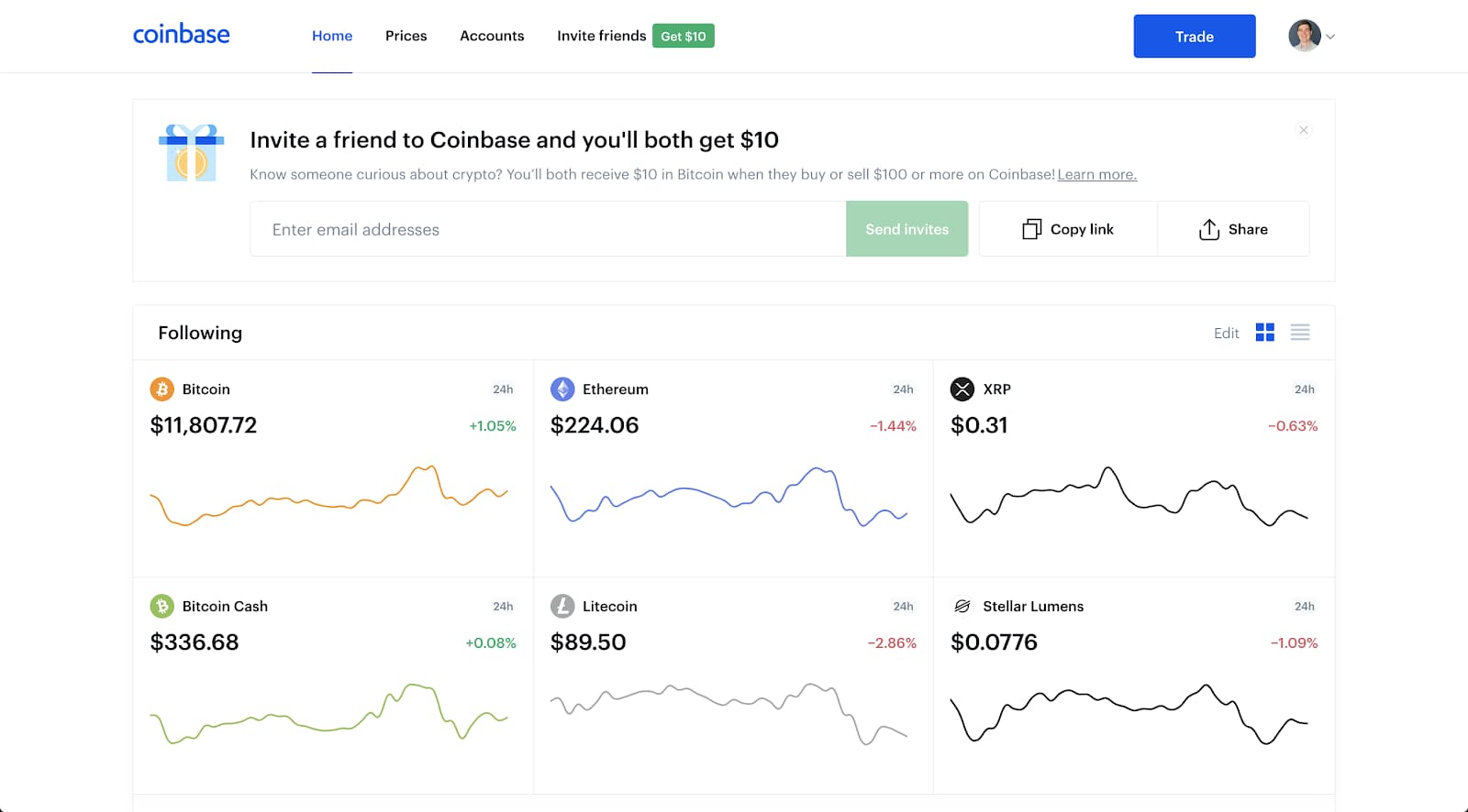
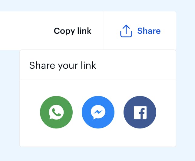
There's nothing like giving free money to gain social clout with your network, but what's even better is getting money in return. Coinbase, a cryptocurrency exchange platform, makes it easy for users to want to promote their platform by offering just that. When users send a Coinbase invitation to a friend, Coinbase gives the friend $10 and the user $10 just for sending it. Referral programs like this typically drive 3-5x higher conversion rates than paid acquisition channels.
The offer floats above the main screen, where users are sure to see it, but it's minimal enough that it won't impede the regular user flow and is easily dismissed. The gift icon is large enough to catch the user's attention and be inviting but not visually overwhelming.
Coinbase also makes it easy on the user by giving them multiple ways to share the invite - entering emails, copying a link to share independently, or sharing via social media links.
Once the user clicks into the invite form, subtle UX design choices affirm them as they take each step. Placeholder text in the email field tells the user exactly what to do. The "send invite" button is functionally disabled and dimmed until a valid email is entered. Once the user hits send, the email field confirms their invite is on its way.
When it comes to getting your users to promote your brand, incentivize the offer and make it easy for them to do.
Calm, the meditation and wellness app, breaks its sign-up flow into single-question screens rather than one long form. Each screen asks just one thing: What's your goal? How much experience do you have? What time of day do you prefer?
This design reduces cognitive load at the exact moment when users haven't committed yet. Instead of facing a wall of fields that signals effort, users see a simple choice they can make in seconds. Making it easy to keep going is the whole job of a sign-up flow.
The approach also doubles as personalization. By the time users finish, Calm has enough context to deliver a tailored first session - which means the sign-up process isn't just friction to tolerate, it's the start of the user experience itself. A frictionless sign-up is the prerequisite for users who will later love your product enough to share it.
Why it works: Single-question screens turn a potentially overwhelming form into a series of easy micro-commitments that build momentum.
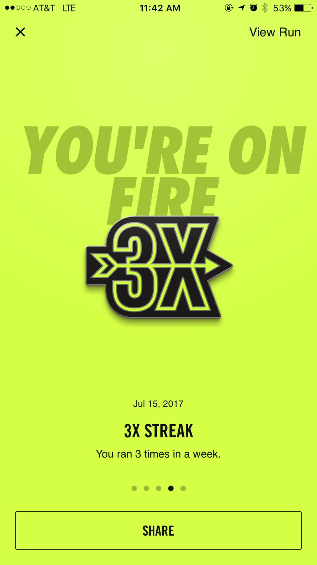
Some product designers think amplification is only about getting users into the app or using the product, but Nike takes it to a new level. Nike uses amplification on their Nike Run Club App to both motivate active users and engage those who may not be as active.
Nike uses gamification in the form of goals to encourage users to keep using the app, and they also use it to their advantage for amplification. When users achieve goals, a celebration screen appears, and Nike uses that runner's high to their advantage by giving the option of sharing the achievement with other users. Sharing the achievement then further motivates the user to keep running and encourages other users to come back to the app when they receive a message from their friend.
Nike Run Club has been downloaded over 100 million times, and peer sharing is a core driver of re-engagement. Amplification doesn't just apply to drawing in new users - it can also mean drawing existing users back in through their peers.
Good UX strategies look different at each stage of the user journey, but they all share the same core principle: reduce friction and motivate the next action. Here's what the best examples teach us:
Want to build UX experiences like these into your own product? Appcues helps teams create personalized in-app experiences that guide users to value - without heavy engineering lift. Book a demo to see how.


.png)