.jpeg)
.png)
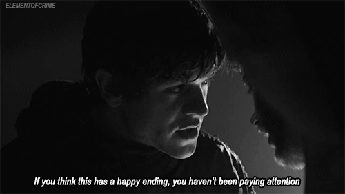
Back in 2019, HBO’s smash hit Game of Thrones ended in a fashion many fans deemed disappointing. After investing eight years in the woes of Westeros, die-hard viewers criticized everything from pacing to seemingly out-of-the-blue character developments. It’s debatable as to whether creative decisions in stories and shows should be dictated by mass opinion. However, the negative response implied a perceived misalignment of why fans watched the show in the first place and the product the creative team eventually delivered.
Now imagine this in the context of your product. It appeals to your customers for specific reasons, so any new features or products should enhance these functions, not hinder or deviate from them. The key to staying the course with your customer base is user research, and there are various user research methods at your disposal.
These four user research methods capture valuable insights about your UI and UX directly from the customer themselves to help guide user-centric product/feature development.
In a card sort, a subject is given literal cards on which the researcher has written individual concepts or terms. The subject is then asked to group these terms into categories by relation. For instance, a subject might place “Wishlist” next to “Shopping Cart” while placing “Update Account” and “Payment Info” together in “Account Settings.”
Card sorting puts foundational design decisions into their own hands. The way your subjects categorize these terms helps provide insight into where your customers are likely to expect certain menu items and features to appear within your UI before ever touching your product. Recording how your customers sort these functions provides you with first-party guidance on how to best structure the information contained within your product.
There are a number of methods to run a card sorting experiment, but the three most common methods include:
Open sorting is a card sort in which your subjects group cards into categories they create and name themselves. This method works well for brand-new products with no pre-existing architecture. It can provide insights into how well your current interface is organized versus how your users would organize it if given the chance.
A closed sort is one in which you provide the categories for your users. This method is effective when you are introducing a new product or feature. You may be unwilling to reinvent the wheel to accommodate a single new feature, so you wouldn’t want to invite users to completely rewrite the framework of your UI. In that case, a closed sort helps you determine where your customers are likely to look for new information inside of your existing system.
Hybrid sorting could be considered “closed sorting plus.” You still provide categories for your subjects, but you give them the ability to create new categories if they’re deemed insufficient. A hybrid sort opens the door for customers to challenge your perceptions of your existing UI by empowering them to suggest alternative methods for organization.
Card sorting is an excellent starting point for your research. It can reveal friction within your existing customer journey or provide a sense of where within your product your customers would seek out a new feature. Another bonus: card sorting can be done cheaply and easily. You could literally have physical cards by in-the-flesh users, but there are platforms such as OptimalSort that can be used for digital sorting exercises.
While card sorting opens a window into the thought process of your customers, A/B testing provides insights into their actual behaviors. A well-constructed A/B test quantifies the impact of UI changes on customer interactions in real time and can be used to validate the suggestions gleaned through other research methods.
A/B tests provide you with behavioral data from your own customers by funneling them through an alternative iteration of your product or flow. For instance, say you are the product manager for an ecommerce site. Recent card sorting exercises suggest that moving the “Wishlist” submenu to an entirely different dropdown menu would positively impact the customer experience. Your team redesigns your UI to reflect this recommendation, but you have no real way of knowing whether the change will enhance or detract from purchasing in a live scenario.
Even if your card sort insights were spot-on, changing the taxonomy of a major feature could negatively impact purchasing. Instead of forcing every one of your customers to use the new iteration all at once, you could instead create a small segment of users and direct them to the new version. Comparing the experience and purchase rates of this group versus a similar group of customers using your current product version will help determine whether the new iteration or existing one provides better results.
The key to proper A/B testing is user segmentation. Building an experimental group of customers that have no history or behavioral likelihood of using a wishlist in the first place won’t provide you with valuable data. Additionally, you want an apples-to-apples comparison of the experimental group against a control group. Brand new users are bound to use your product differently than longstanding ones. This means you wouldn’t want to create a control group of one and an experimental group of the other. Instead, you should create user segments consisting of demographically and behaviorally similar customers for the sake of your research.
A/B tests are highly repeatable. If you want to move your shopping cart icon to one of six possible locations within your UI, you can A/B test each version against the others until it becomes clear which option optimizes performance. Constructing and executing these experiments are also usually quicker than, say, convincing 100 customers to perform card sorting exercises or performing 100 usability tests.
Big fish like Netflix frequently use their customer data to make improvements to their UI. For example, their team theorized that a Top 10 list of movies and shows by location or genre would improve customer satisfaction—and a series of A/B tests proved them right.
Unless you’re making apps for cryptids, the way your users interact with your product will be restricted by human biological constraints. Eye tracking helps identify blind spots and shortcomings in the UI caused by how the human eye perceives and engages with images and text on a digital screen.
Pay attention to how your eyes move as you’re reading this paragraph. If everything’s hunky-dory, they should be flitting across your screen in small bursts. Your eyes focus on several words at a time before leaping to the next group of words instead of gliding smoothly through each sentence. These bursts are called saccades, and now that we’ve pointed it out, you’re going to notice it every time you read. (Sorry!)
So what do saccades have to do with user research? Think about a physical product like shoes. Nike designers must have a solid handle on how feet work to create shoes that enhance walking and running, not hinder it. Your UI is almost entirely visual in nature, so developing an understanding of how eyes move across it can reveal limitations in your existing design.
A typical eye-tracking test consists of a number of gadgets, including cameras, sensors, and software with which to process it all. Despite the complexity of the setup, the actual test is remarkably simple. Essentially, a user is filmed interacting with a product. The software marks where on the interface the subject’s eyes focus and where they jump to next. With this knowledge in hand, product managers can identify how customers navigate their UI and what aspects of their product are visually prioritized—and even in what order.
Eye tracking might reveal that customers entirely skip over vital features because icons are too small or buttons are in the wrong location. An eye-tracking test might even reveal that the underperformance of a certain product or feature is a design issue, not a demand issue.
Depending on what your product actually does, information lost to poor UI design can range from incidental to catastrophic. The United States Navy employed EyeTracking, a company that develops products for, well, eye tracking, to test the viability of training software used aboard their maritime vessels. EyeTracking’s tests identified components of the UI design that contributed to users skipping over critical information or overcomplicating tasks—neither an ideal situation in potential high-stress military emergencies. The Navy was then able to correct the points of friction before rolling out the training software across the board, potentially avoiding UI-inhibited bungling during a high-risk scenario.
Sometimes, the simplest way to determine what users are struggling with is to watch them struggle. Usability tests provide you with a front-row seat to the UI/UX issues your customers have as they’re having them.
In a usability test, an interviewer asks a subject to complete a series of tasks. For your hypothetical ecommerce site, a task might be, “Purchase a holiday sweater for a small dog.” The subject would then do their best to search for holiday dog sweaters, add a sweater to the cart, and then complete the purchase. Meanwhile, you would record the subject as they engage with your product for later analysis.
As few as five subjects can detect around 85% of usability issues, with results increasing with the number of tests subjects. A well-rounded batch of usability tests should cover customers of different demographics and behavioral tendencies for a complete picture of how your customer base interacts with your product. For instance, a usability test performed for Duolingo through TryMyUI identified issues with the font used in the mobile app. The font choice led to one user reading uppercase Is as lowercase Ls, resulting in confusion in their very first foreign language lesson.
Like eye tracking, usability tests are meant to discover where UI shortcomings create friction. However, usability tests aren’t just concerned with how the user perceives the UI. The tests gauge the difficulty of completing tasks within the interface as customers use the product in the way it’s intended. In a test environment, product managers and development teams may use a feature or product with no issue because they’ve developed it from the ground up. Customers in the real world are unlikely to interact in the same way simply because they don’t have inside knowledge on how your product is “supposed” to work.
Different user research methods can be used together to get the best sense of the relationship between your UI and UX. Sometimes insights may reveal the need for updates or fixes to alleviate frustration in the current UX. Additionally, these methods can be used to spark inspiration about your next feature or product, all while staying true to why your customers are using your product in the first place.
Unlike a TV show, your product doesn’t have a grand finale. Instead, it has to constantly deliver excellence through updates and changes. Before building what’s next, it’s worth checking in with your customers to ensure what you’re giving them is what they’ve been waiting for.


.png)