.png)
Onboarding screens are your product's first handshake - and most SaaS companies fumble it. With 25% of users abandoning apps after a single session, the screens you show in those first few minutes directly determine whether someone sticks around or churns.
The best onboarding screens combine the right pattern with the right timing. The most effective products layer several screen types together rather than relying on a single pattern.
Great onboarding is personal and data-driven. Personalize flows with welcome surveys, introduce features gradually - and track activation rate to keep improving.
25% of users abandon an app after just one use if they don't immediately understand its value - and that loss shows up directly in revenue.
For SaaS products, onboarding screens are the bridge between signup and the moment a user actually gets value from your product. Products with strong onboarding consistently convert more trial users and retain them longer. Skip it, and you're paying for acquisition that never sticks.
This article covers what onboarding screens are, why they matter, the main types you should know, and 16 real user onboarding examples from SaaS products that nail it. You'll also get best practices backed by specific company examples, plus the most common mistakes to avoid.
Onboarding screens are the in-app interfaces a user encounters during their first interactions with your product. They guide setup and introduce key features - all with the goal of getting a new user to their first meaningful success as quickly as possible.
That includes welcome modals, interactive walkthroughs, checklists, progress indicators, tooltips, and empty states. Essentially, any screen or UI element designed to move a new user from "I just signed up" to "I see why this matters."
What onboarding screens are not: they're not your marketing landing page, your static help docs, or your signup form. Those live outside the product experience. Onboarding screens are what happens after someone is already inside your app.
A common misconception is that onboarding equals signup. Signup gets someone through the door. Onboarding is what happens once they're inside - the guided experience that helps them find value before they lose interest. For a deeper dive, see our guide to user onboarding best practices.
For example, Shopify's onboarding doesn't just welcome new merchants. It walks them through adding their first product, then guides them into theme selection and payment setup - each screen designed to get the user closer to launching their store. That's the difference between a welcome message and actual onboarding.
The business case for onboarding screens comes down to one metric: activation rate. Users who reach their "aha moment" quickly are far more likely to convert from trial to paid and stick around long-term. Poor onboarding is one of the leading drivers of early churn in SaaS. According to Wyzowl, 86% of customers say they're more likely to stay loyal to a business that invests in onboarding content. And as Harvard Business Review found, boosting retention rates by just 5% can increase profits by up to 95%. Every dollar spent on acquisition is wasted if the onboarding experience doesn't deliver.
Products that invest in structured onboarding flows see measurable improvements in trial-to-paid conversion and retention. Grammarly, for instance, onboards new users by having them edit a pre-written document that showcases every core feature in action. Users don't just read about the product - they experience it. That hands-on approach drives activation because the value is immediately tangible.
For product managers, small changes - like reordering steps or personalizing the flow by role - can move activation rates by double digits. For founders, that translates to better unit economics: lower churn and higher lifetime value without constantly increasing acquisition spend.
Not every onboarding screen serves the same purpose. The best products mix several types together, matching the right pattern to the right moment. Here are the six most common types.
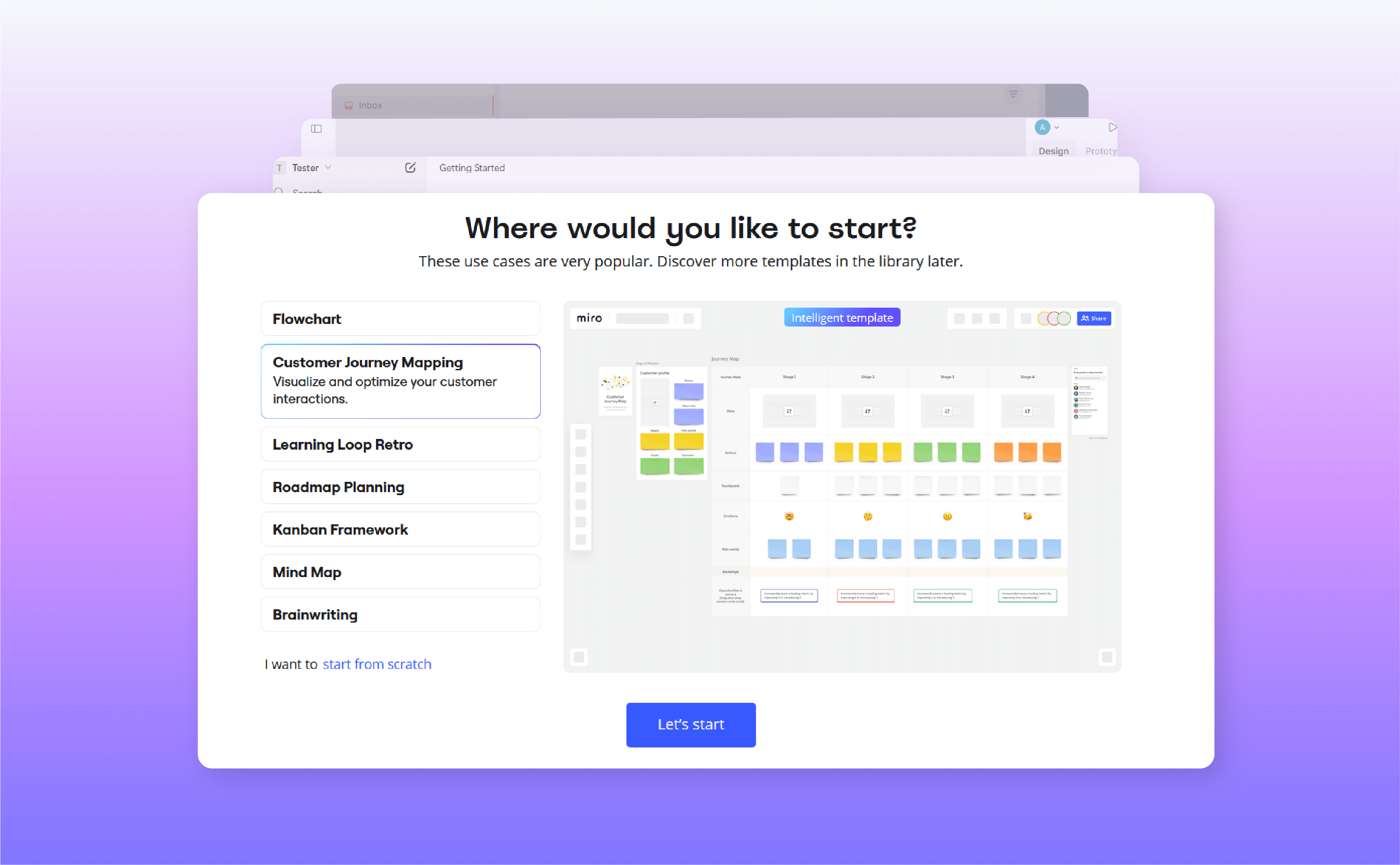
Greeting modals are simple full-screen or pop-up interfaces that welcome users and provide an overview of the product or the onboarding process. Miro, for example, uses greeting modals to introduce users to templates and collaboration tools.
Why use them:
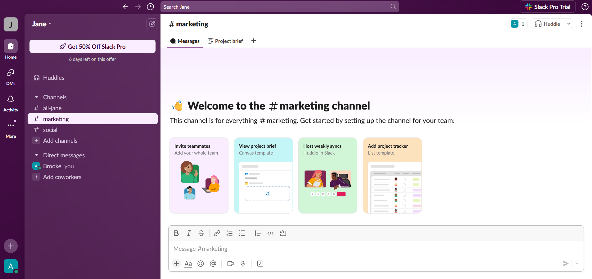
Interactive guides are step-by-step walkthroughs where users perform tasks while being guided. For example, Slack introduces new users to its workspace by showing them how to send messages and join channels.
Why use them:
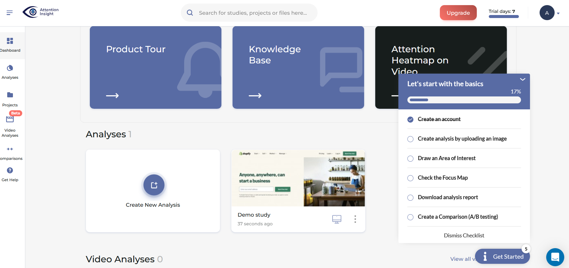
Checklists display a list of tasks users need to complete, often with progress tracking or status indicators. Attention Insight, for instance, uses checklists to encourage users to upload content and configure settings.
Why use them:
Progress bars, like in the Superlist example below, are visual indicators showing users how far they are in the onboarding process.
Why use them:
Empty states are placeholders with instructional content that appear when a feature lacks data, such as a new user's dashboard before they've created anything.
Why use them:
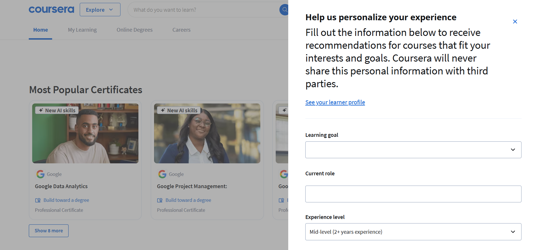
Welcome surveys ask a few quick questions at the start - what the user's role is and what they're trying to accomplish - so the product can tailor what comes next. Coursera, for instance, collects learning goals and current role to personalize course recommendations from the first session.
Why use them:
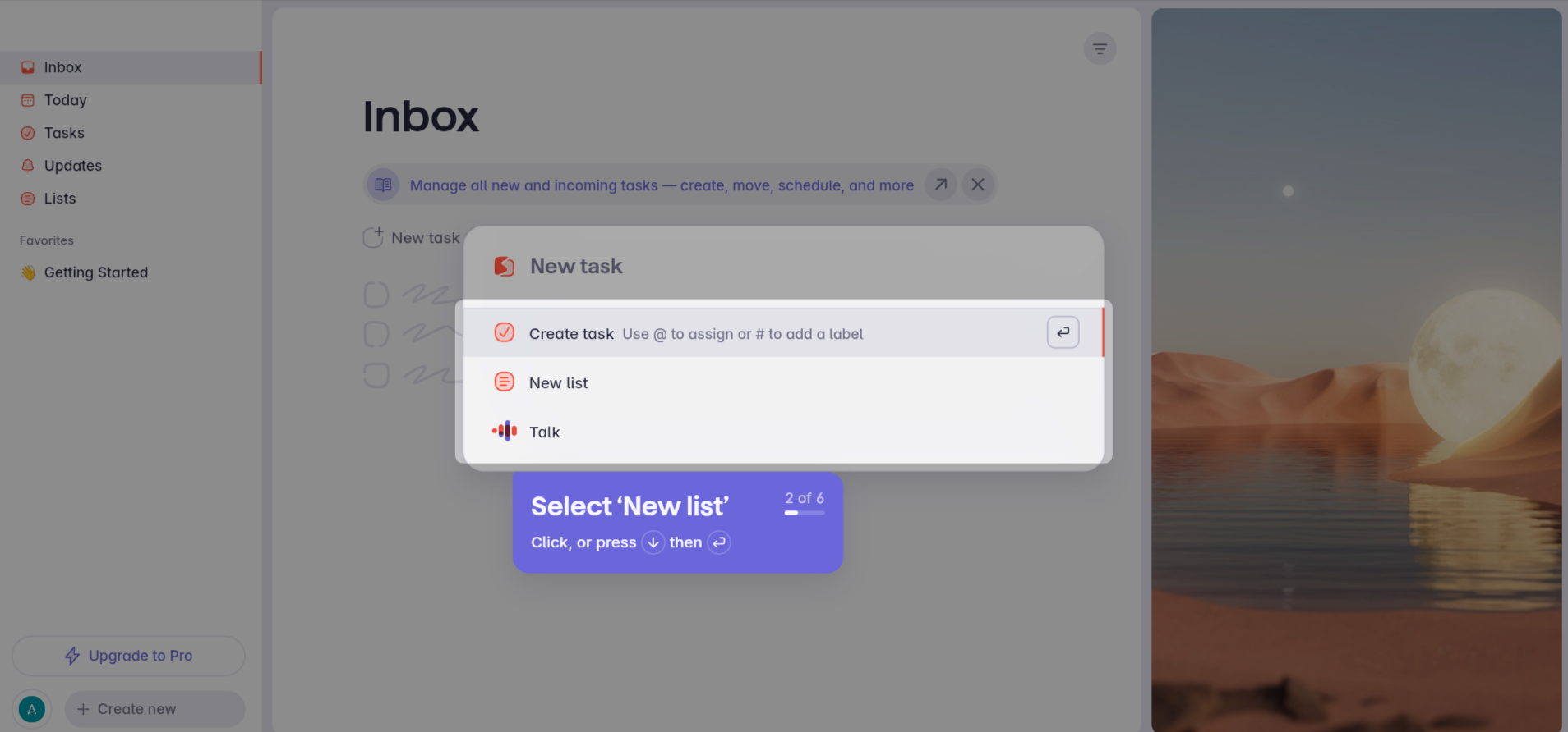
The best way to learn what makes onboarding work is to see it in action. Here are 20 examples from SaaS products that get onboarding right - each demonstrating a specific pattern worth learning fro16
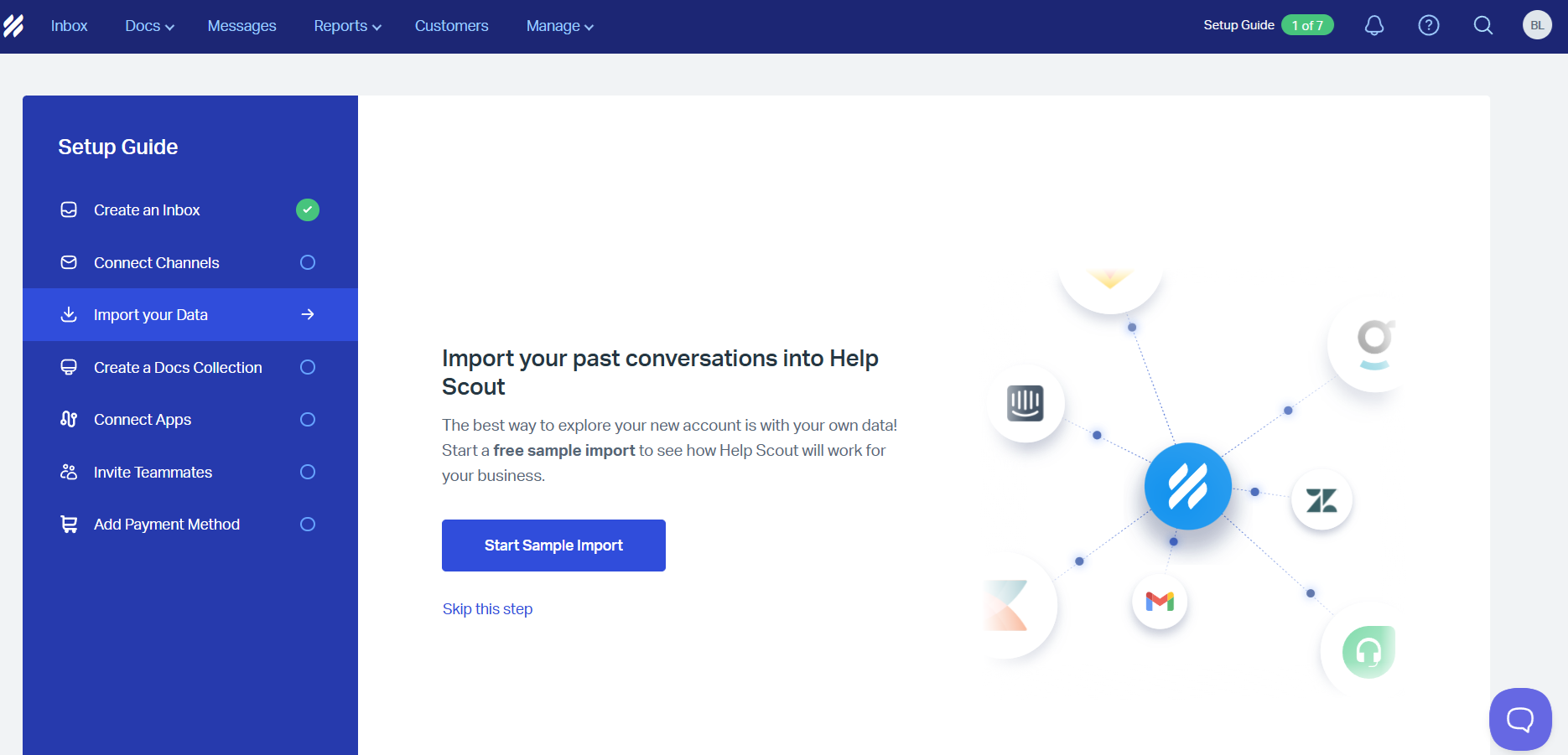
Help Scout's onboarding is everything a growing support team needs to hit the ground running. The initial setup guide provides clearly labeled steps so users can map out their customer support workflow on day one.
With clean visuals and action-oriented prompts, users instinctively know how to proceed, whether it's starting a sample import or connecting their existing tools.
Pattern: Step-by-step setup wizard. What makes it work: Each step maps to a real workflow task, so users are building their actual workspace - not just clicking through a demo.
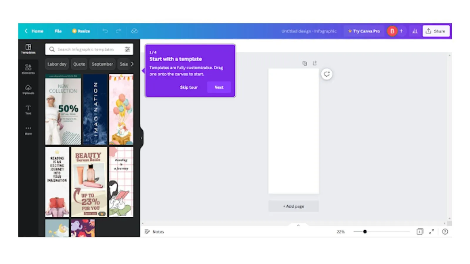
Canva's onboarding drops users into a pre-built design project that doubles as a tutorial. Instead of explaining features in a modal, the app walks users through editing a real template - adding text and swapping images. By the time you finish, you've already created something shareable.
Pattern: Learn-by-doing embedded tutorial. What makes it work: The first action delivers immediate, visible value - users have a finished design before they've even explored the dashboard.
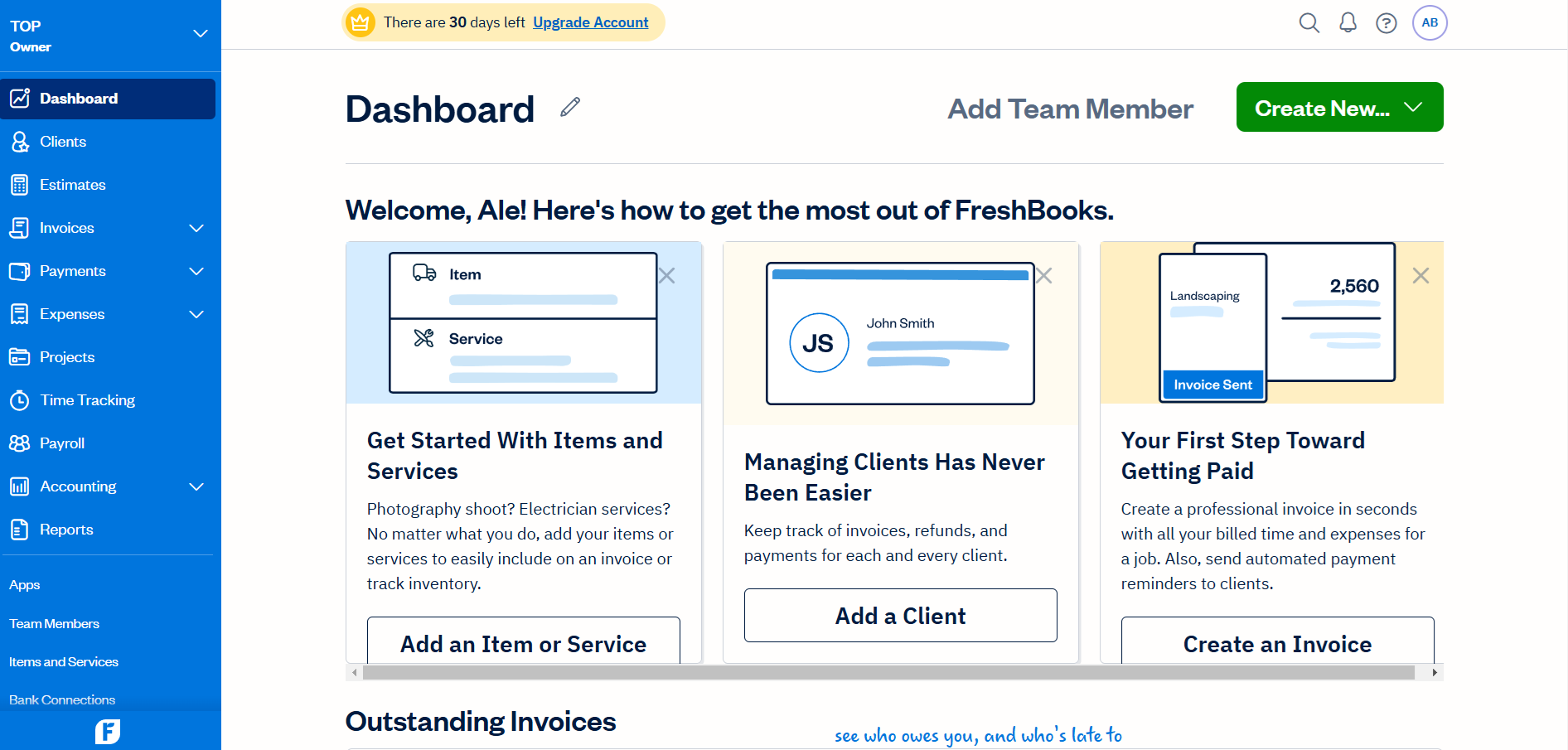
FreshBooks' onboarding is built around what small business owners actually need: getting invoices out the door. The dashboard provides step-by-step guidance with labeled sections to help users add clients and invoices - with a focus on speed that matches the urgency of the task.
Pattern: Task-oriented dashboard. What makes it work: It prioritizes the user's most pressing job to be done rather than showcasing every feature.
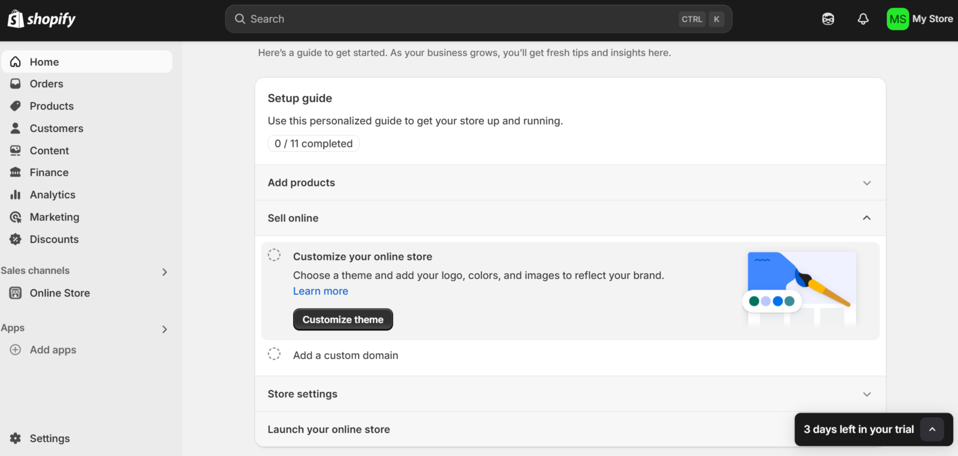
Shopify's onboarding combines utility and practicality in a way that feels tailored to busy entrepreneurs. The personalized setup guide breaks the process into manageable steps, while a progress tracker provides clarity and motivation.
Subtle touches like a trial countdown add just enough urgency to keep users engaged without feeling pushy.
Pattern: Personalized setup guide with progress tracking. What makes it work: Every step moves the user closer to a real outcome - a live store - not just product familiarity.
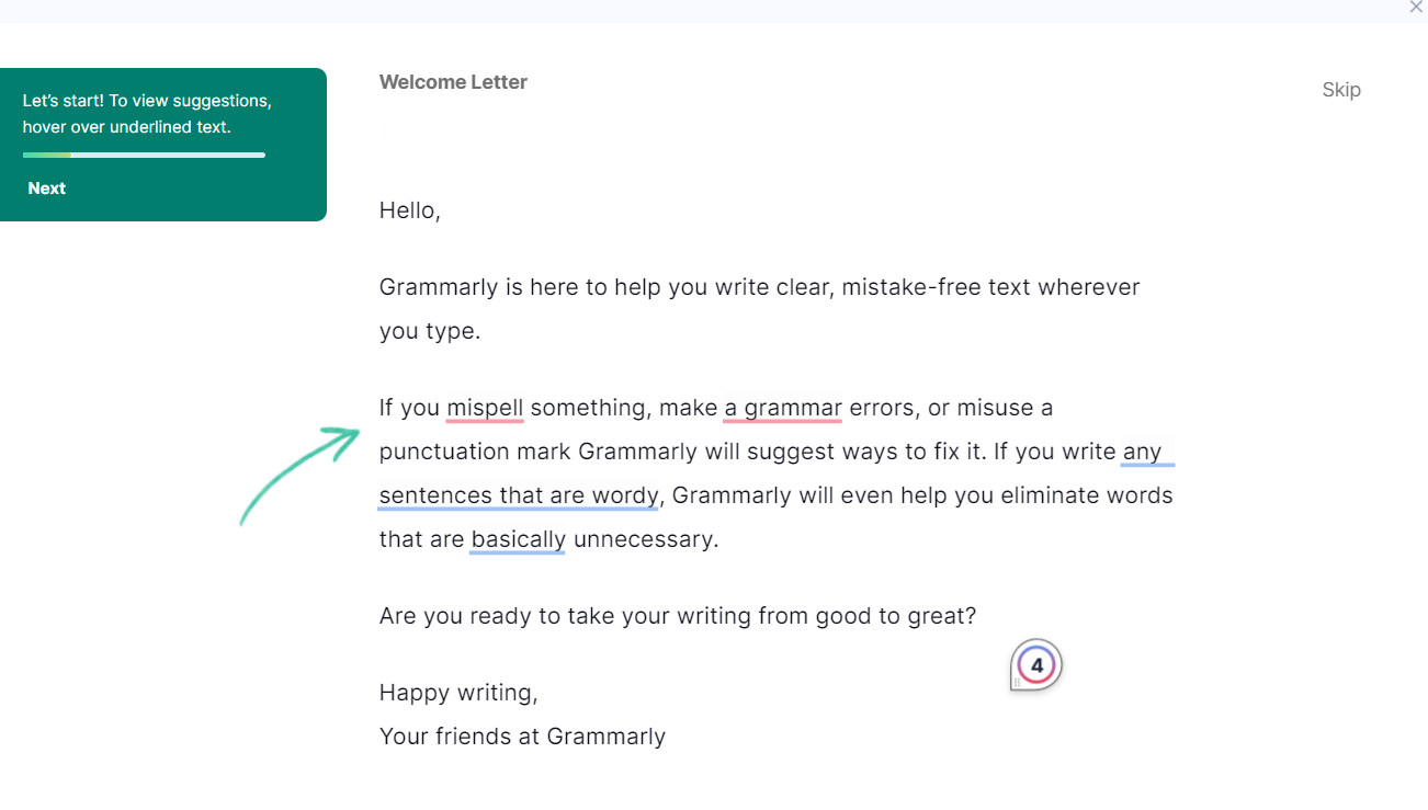
Grammarly's onboarding shows new users exactly what using the app is like. The highlighted suggestions instantly demonstrate the platform's value, showcasing how it catches errors and streamlines writing.
By using a conversational tone and interactive elements, they remove any intimidation users might feel about improving their writing.
Pattern: Interactive product demo. What makes it work: Users experience the core value proposition in their first minute. No explanations needed - the product speaks for itself.
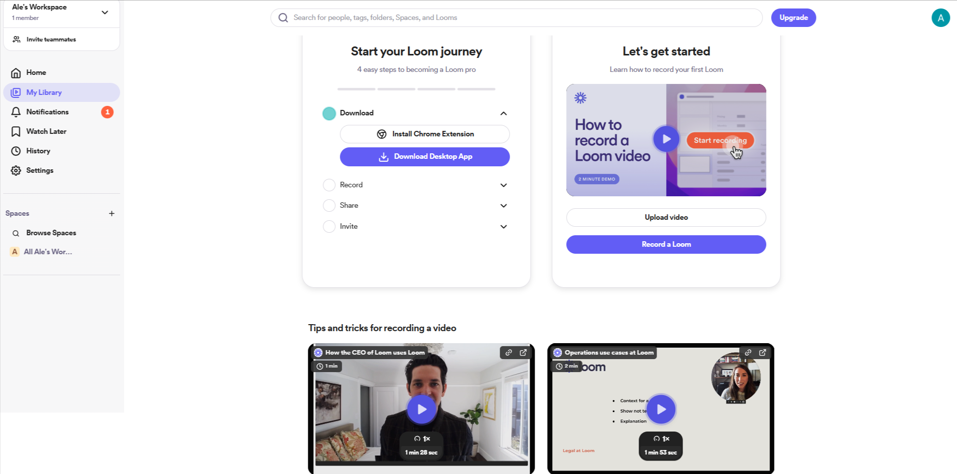
Loom's onboarding strikes a balance between utility and engagement, with a clear step-by-step journey that feels intuitive rather than overwhelming. The promise of easily recording videos in a few clicks keeps things simple and time-conscious. The inclusion of demo videos makes the experience visually engaging and approachable.
Pattern: Guided first action. What makes it work: The onboarding mirrors the product's core promise - simplicity and speed - so the experience itself reinforces the value.
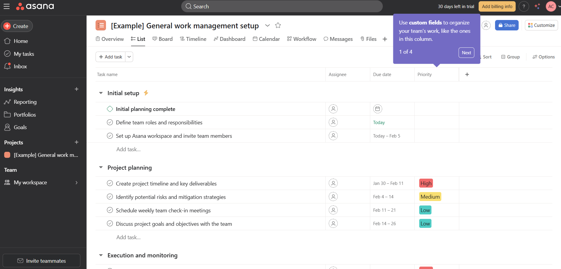
Asana's onboarding prioritizes getting new users comfortable with common in-product tasks such as managing tasks within projects. The app goes a step further to explain organizational features like custom fields and get users familiar with navigating common workflows.
There's a lot to do within this screen alone, but the onboarding experience is smoother thanks to the clarity of the interactive tooltips.
Pattern: Contextual tooltips on a real workspace. What makes it work: Users learn by doing actual work, not by watching a tour of features they haven't needed yet.
Coursera's onboarding personalizes the learning journey from the first screen. It collects each user's learning goals and current role, then uses that data to tailor course recommendations - and the instant focus on popular certifications adds an immediate sense of value.
Pattern: Welcome survey with personalized output. What makes it work: The survey isn't just data collection - it immediately changes what the user sees, making personalization feel real.
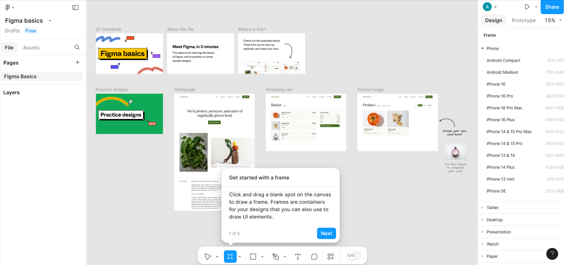
Figma's onboarding puts users straight into a design environment. It introduces core features like frames and layers through an interactive workspace with tooltips, making the experience both visual and hands-on - approachable even for beginners.
Pattern: Interactive workspace with contextual guidance. What makes it work: Instead of explaining what Figma does, the onboarding puts users inside a real project from the start.
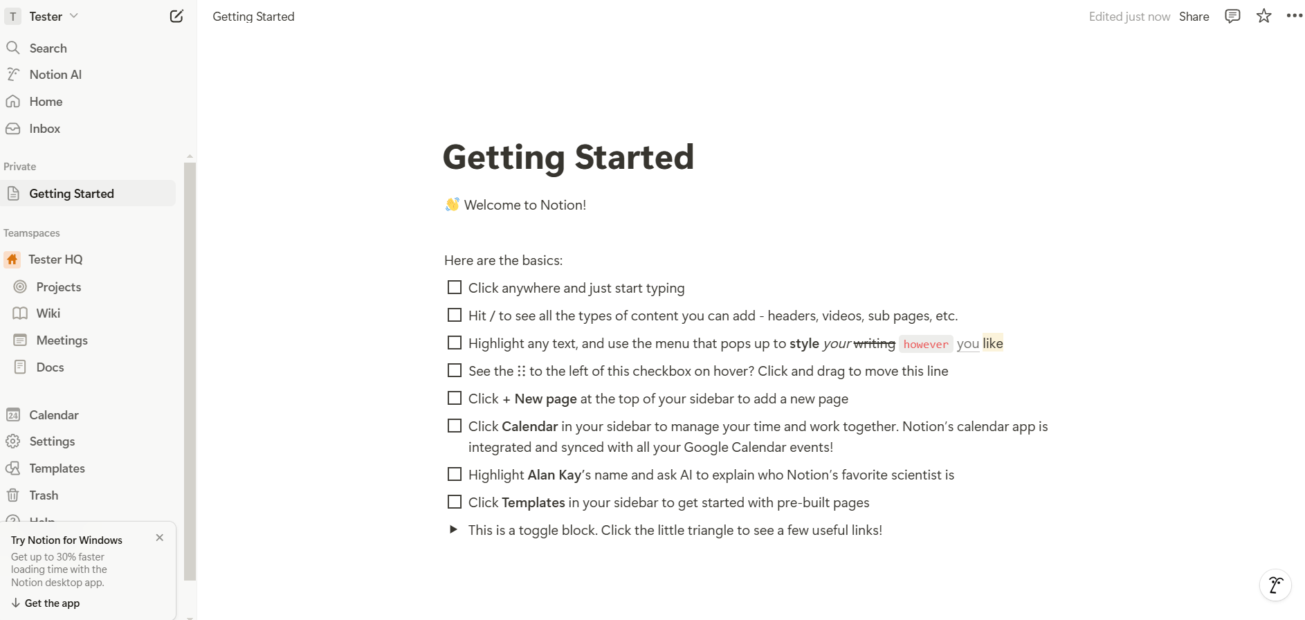
Notion uses an apparently simple checklist for their onboarding. In reality, this checklist already introduces one of its own features, getting users ready to start doing basic actions.
Each step adds an extra in-app skill, getting users confident with the next action items. The subtle animations and clean layout make an otherwise complex product feel approachable.
Pattern: Feature-as-onboarding checklist. What makes it work: The onboarding tool is the product. Users learn Notion by using Notion, which collapses the gap between "learning" and "doing."
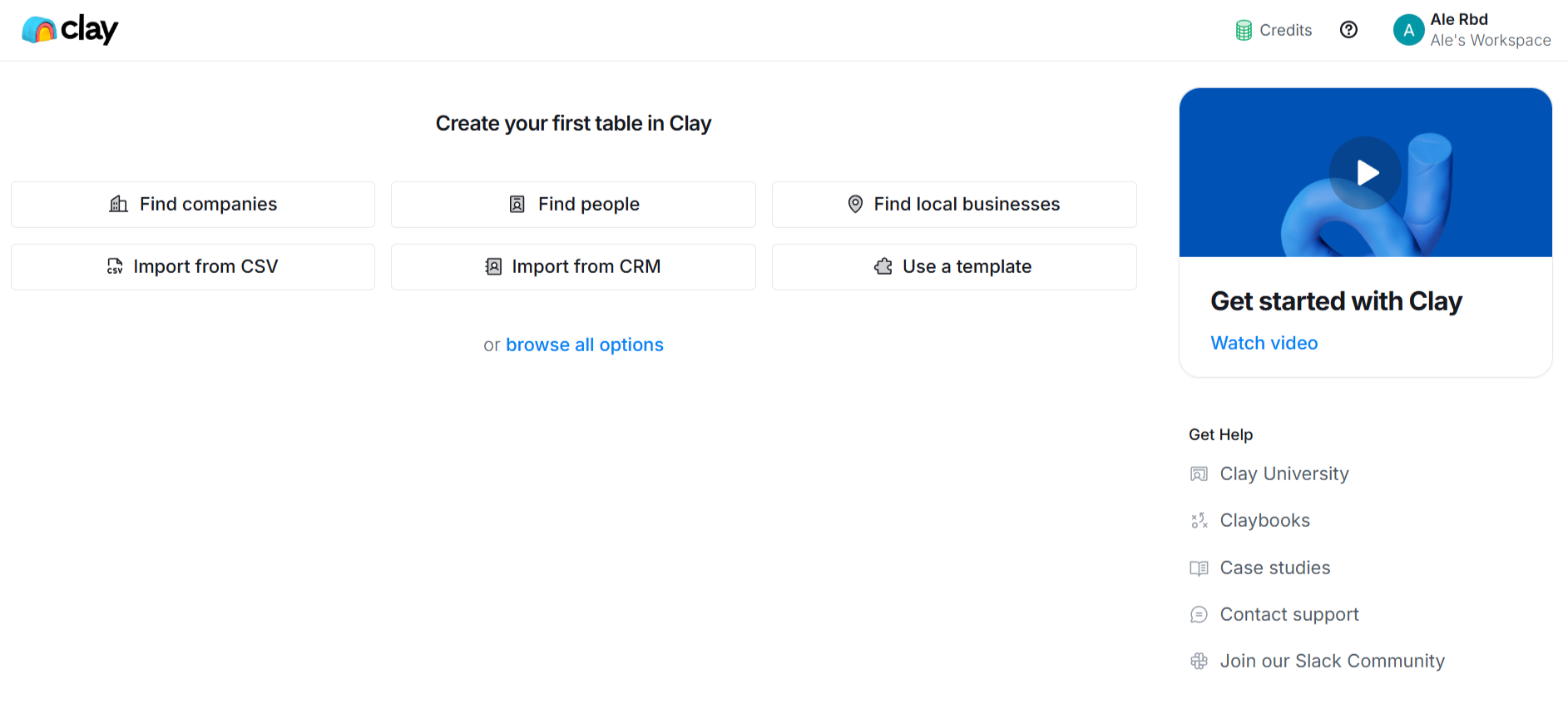
Clay doesn't push users toward a single action. Instead, it offers multiple entry points alongside a prominent video tutorial and links to Clay University for deeper learning. The modular approach lets users find their own path.
Pattern: Self-directed hub with video guidance. What makes it work: For a power-user tool, giving users agency over their first steps respects the complexity of their use cases.
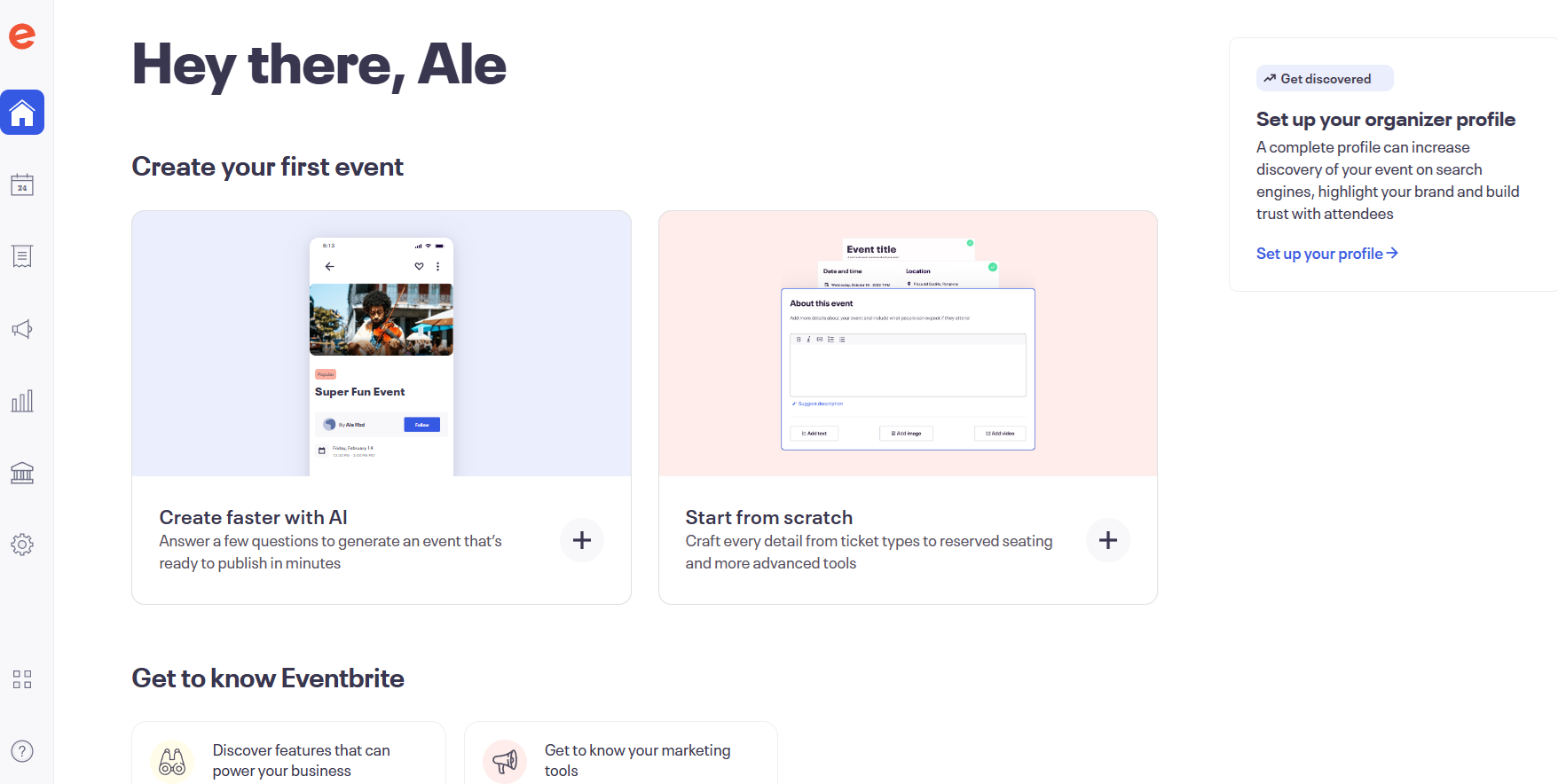
Eventbrite greets users with options to create events via AI-generated setups or from scratch - leading with the app's core purpose. Marketing and discovery features come second, letting users explore at their own pace.
Pattern: Action-first landing with AI assist. What makes it work: The onboarding leads with the user's primary job to be done and offers AI as an accelerator, not a gimmick.
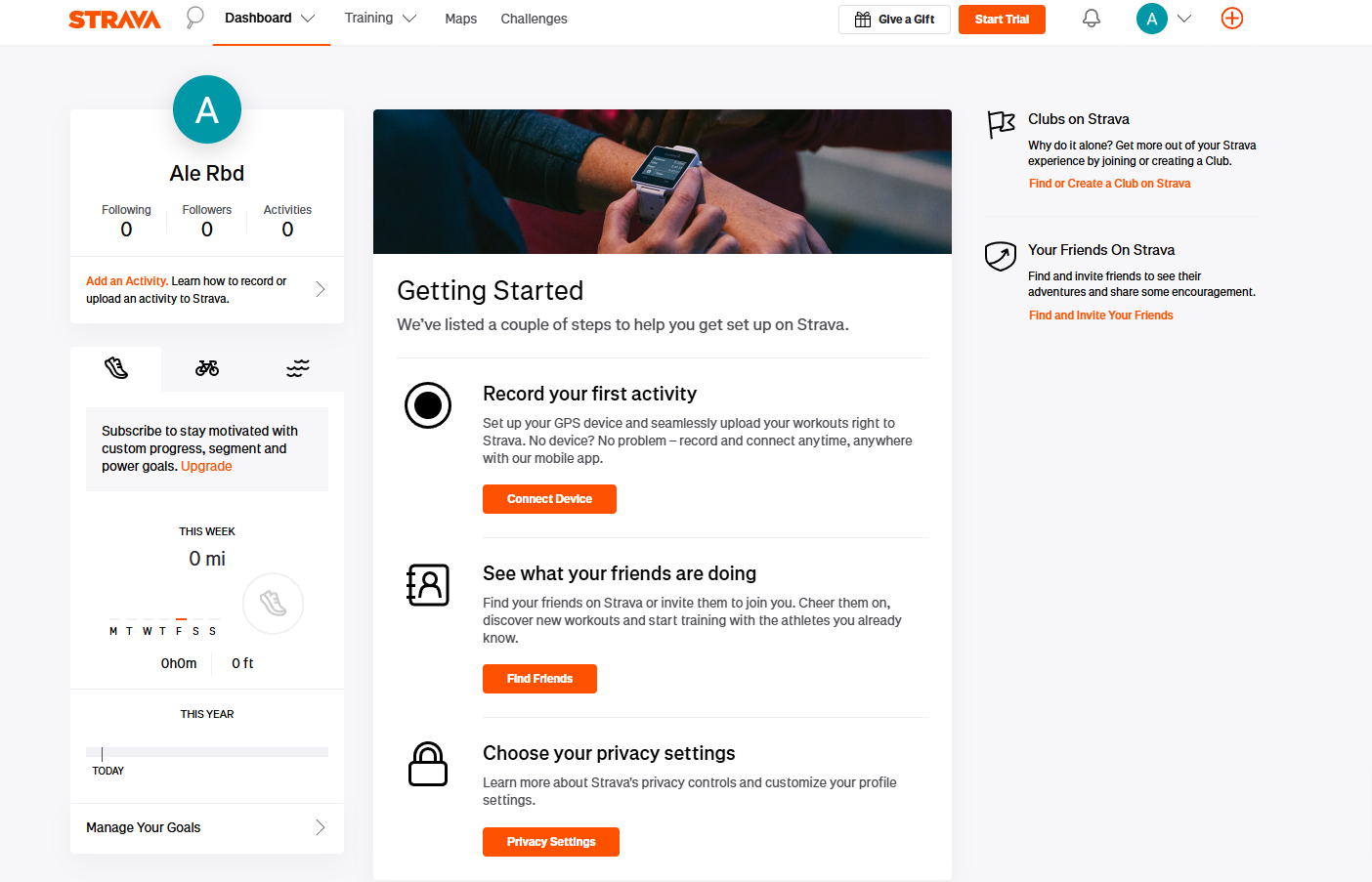
Strava previews what users' stats will look like once they're active, then walks them through setup steps. It's a retention-focused approach - users who complete setup are far more likely to turn the app into a daily habit.
Pattern: Outcome preview plus setup checklist. What makes it work: Showing users what success looks like before they've done anything creates motivation to complete the setup.
LearnWorlds' onboarding screens follow a classic checklist format. A welcome page precedes multiple screens that take the target audience through a step-by-step onboarding flow.
Beyond the welcome message, what matters most is that this screen highlights key actions first-time users should complete.
Pattern: Welcome page plus sequential checklist. What makes it work: It focuses on completion of essential actions rather than feature exploration, keeping users on a clear path.
Odoo does things a little differently with an onboarding that blends utility and engagement. The promise of a free mug adds a playful incentive for users to complete their profiles.
The conversational tone and whimsical design choices make what could be a complex process feel approachable.
Pattern: Gamified incentive with conversational tone. What makes it work: A tangible reward for completing onboarding creates a motivation loop that pure UI guidance can't match.

Appcues practices what it preaches. The onboarding experience uses the same in-app patterns that customers build with the platform - checklists paired with contextual tooltips. New users are guided through creating their first flow and publishing a live experience.
It's a hands-on introduction that doubles as proof of concept: by the time you finish onboarding, you've already used the product to build something real.
Pattern: Product-as-proof onboarding. What makes it work: The onboarding itself demonstrates the product's value. Users don't just learn about creating onboarding experiences - they build one.
Examples are a starting point, but to move your activation metrics you need principles you can apply to your own product. Here are eight practices that consistently separate high-performing onboarding from the rest.
Customize onboarding screens with welcome surveys that capture what you actually need to know about your users - their role and what they're trying to accomplish.
Duolingo does this well. Before a single lesson loads, the app asks about your target language and daily time commitment. Every screen that follows reflects those answers. The result: onboarding feels tailored, not templated.
The key is making sure the survey's output is visible. If you ask three questions and the experience looks the same regardless, users notice. For more patterns, see these onboarding checklist examples.
Introducing features gradually prevents cognitive overload. Highlight essential actions first - like creating a project or sending a first message - and reveal advanced capabilities as users demonstrate readiness.
Figma nails this. New users start with basic frame and shape tools. Prototyping and dev mode surface later, only when behavior signals readiness.
People care about what a product can do for them. Instead of saying "Enable two-factor authentication," apps like Google emphasize, "Add an extra layer of security to your account."
The shift is subtle but meaningful: lead with the benefit, not the feature. Use conversational language that feels like a real person wrote it. Every onboarding screen is a chance to reinforce that your product understands the user's goals.
Clean layouts and progress bars create an intuitive, visually pleasing flow. Notion's onboarding uses soothing animations and empty states to encourage users to explore, turning what could feel like a blank canvas into an inviting starting point.
Visual design isn't decoration. It's guidance. Color and contrast should direct attention to the next action, not compete for it.
The best onboarding responds to what the user is actually doing. Behavioral triggers show guidance at the right moment: a tooltip when a user hovers over a new feature, a prompt when someone appears stuck, or a nudge when a key action goes uncompleted.
The trick is restraint. Too many triggers and the experience feels like a pop-up minefield. Use them sparingly and always with a clear purpose.
Onboarding doesn't end at the edge of your app. The best teams reinforce their product messaging across channels - welcome emails and push notifications that nudge users to return and complete their setup.
Personalize these messages based on specific user actions. A user who created a project but didn't invite teammates gets a different email than one who hasn't logged in since signup. That precision requires event tracking, but the payoff in activation is significant.
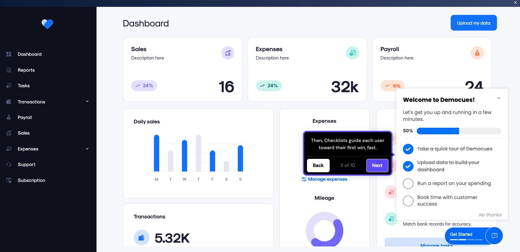
Don't guess what works - test it. Variations worth testing include copy, visuals, step count, and action order. Tools like Appcues let you run flow-level A/B tests and analyze the results without engineering support, so product teams can iterate on onboarding as fast as they iterate on the product itself.
Track where users abandon the onboarding process to identify friction. Common culprits: forms that are too long and confusing instructions that leave users guessing at their next step.
Pair quantitative drop-off data with qualitative feedback from in-app surveys. The combination of "where" and "why" is what turns onboarding data into actionable improvements.
Even well-intentioned onboarding can backfire. Here are four mistakes that consistently hurt activation - and how to fix them.
The cause: Trying to show every feature at once because the team is proud of everything they've built.
The fix: Limit the first session to 3-5 core actions that lead to the user's first success moment. Use progressive disclosure to introduce everything else over time.
The cause: Skipping segmentation because it feels like extra work or the team doesn't have enough user data yet.
The fix: Add a welcome survey - even two or three questions is enough to branch users into different flows by role or goal. A marketing manager and a developer don't need the same first screen.
The cause: Designing onboarding for desktop and assuming it translates to smaller screens.
The fix: Build responsive onboarding screens with touch-friendly interactions. Reduce the number of steps on mobile and use larger tap targets. Always test on actual devices. Our mobile onboarding guide covers this in depth.
The cause: Treating onboarding as a "set and forget" project that ships once and never gets revisited.
The fix: Track activation rate, drop-off points, and time to value from day one. Run A/B tests on individual steps. Review the data monthly. The best onboarding flows are living systems, not static experiences. Our onboarding optimization guide walks through a repeatable framework for this.
Effective onboarding screens guide users with clarity and turn signups into activated customers. Here's what great onboarding delivers:
To build onboarding that works:
Appcues helps product teams create and optimize in-app onboarding flows without engineering bottlenecks. See how it works for your product.


.png)