.png)
If you’ve ever redesigned a core feature—especially one teams use every week—you know how risky it can feel to just… flip the switch. One way to ease that transition is with a hatch: a simple way to let users move between the old and the new. It’s the digital equivalent of propping the door open while you step outside for a sec.
We used in-app experiences to create a hatch, giving early access to our new NPS builder (think: multiple surveys, more customization—all the fun stuff you’ve been asking for).
Big changes need breathing room. Here’s how we made that space—with nothing more than a feature flag and a couple of Banners.
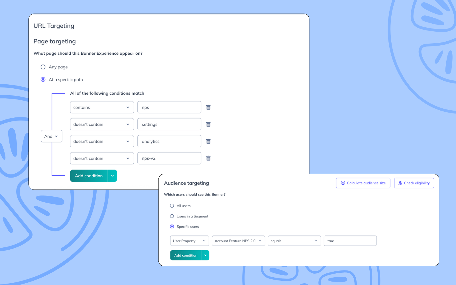
Beta participants were automatically sent to the new builder (/nps-v2), while everyone else stayed on the original (/nps). A simple feature flag passed into Appcues as a user property made it easy to target the right users.
Since beta users were dropped right into the new experience, we added a banner across the top of /nps-v2 with three quick options:
That last one? Just a basic link to /nps. No toggles or extra logic—simple and effective.
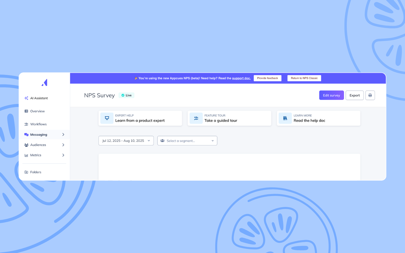
To keep things flexible, we added a matching banner on the original /nps page. It only shows for beta participants and includes a “Try the new version” button that links to /nps-v2. That way, users can explore at their own pace, from either direction.
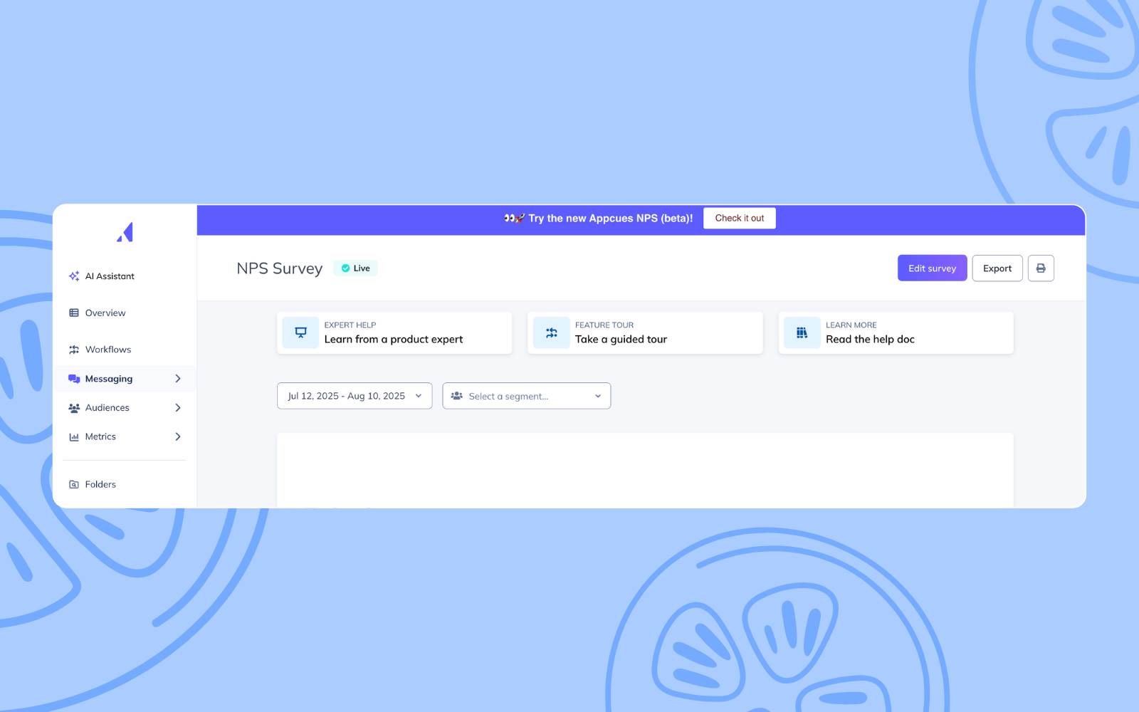
Both banners are targeted using the feature flag user property and simple page rules. One shows up on /nps, the other on /nps-v2. That’s it.
We’ll collect feedback through the in-app Flow and watch how beta users engage with the new version. The setup makes it easy to iterate in real time—without needing to roll changes out broadly or commit before we’re ready.
And you can bet we’ll be back with another story on how we approach the full rollout and announcement. 😉