
.png)
The average mobile app loses 75% of new users on day one. This guide covers everything you need to stop that: the three types of onboarding flows, how to find your app's aha moment, the UI patterns that actually work, and how to measure whether any of it is sticking.
Launching a mobile app is hard. Getting people to use that app (more than once) is harder.
Average new user activation and retention rates on mobile apps are low and getting worse over time. According to Appsflyer's 2021 analysis of 6 billion app installs, the average app loses over 75% of new users on day one. By day 30, fewer than 5% of users remain active.

And yet, people are increasingly willing to try new mobile apps: 64% of millennial users say they are downloading more apps now than they did a year ago. That's good news for the top of your funnel. Building a growing and active mobile user base starts with hooking users on day 1 with a stellar onboarding experience.
This guide covers everything you need to do that: the basics of mobile app user psychology and motivation, how to craft and optimize your app's first impression, real examples from successful apps, and how to measure and improve what you build.
User onboarding is like a first date. You've got one chance to make a good first impression, and a wrong move or bad joke makes you a prime candidate to get ghosted. The most important moments users spend in your app are the very first. During those early days, it's crucial to get it right: no bugs, no crashes, no usability problems allowed.
Effective app onboarding ensures that users experience the app's benefits during this window. A well-crafted onboarding experience helps users quickly grasp the app's value, reducing the likelihood of confusion or frustration, which encourages them to continue exploring the app.
Before diving into improving your onboarding experience, it's worth addressing one of the biggest mistakes mobile teams make: thinking about their mobile app as merely an extension of their website or web app.
Attracting and retaining the attention of mobile app users is an incredibly competitive business, and the strategies that brought you success on the web don't always translate to mobile. There's simply a lot more friction involved in mobile adoption. Think about the process of downloading an app for the first time. First, you've got to learn about the app (what it's called, what it does, why it's worth your time and money), then find it in your phone's app store, then grant approval for the app to take up precious real estate on your phone, and then finally download it to your device.
That's a lot of hoops to jump through before you even open it.
The real estate on your users' phones is equally valuable, so valuable that nearly 20% of users say they've deleted an app because they thought the icon was too ugly for their home screen.
You might think the effort required to download and install a new mobile app would filter out the least interested folks, resulting in a more intentional and engaged cohort of new users, and it usually does. The problem? Those that do make it through are no more charitable with their time.
Clutch found that if an onboarding experience takes longer than 2 minutes, many people just give up altogether. In other words, you have 120 seconds to help your mobile users find value. Or lose them forever.
The golden rule of mobile apps: don't waste their time.
There are three common types of onboarding flows used in mobile apps. Understanding the differences helps you choose the right approach for your app and your users.
Benefits-oriented onboarding focuses on highlighting the app's value by showcasing key benefits through engaging content, appealing to users' emotions and motivations. Rather than explaining how the app works upfront, this approach ensures users understand what's in it for them before diving into the details.
This type works particularly well for consumer apps, fitness apps, and lifestyle products where emotional buy-in drives early engagement. Think of a fitness app that leads with transformation ("Track your runs. Hit your goals. Stay consistent.") before showing a single feature.
Function-oriented onboarding is centered on teaching users how to use the app's core functionalities right from the beginning, guiding them through key features and actions to ensure effective usage. It's designed without overwhelming users, striking a balance between instruction and immediacy.
This approach works best for productivity apps and photo editing apps, as well as for tech-savvy users who want to get straight to work. Users in this category often prefer to understand how before they care about why.
Progressive onboarding introduces information and features gradually as the user navigates the app, reducing cognitive load and allowing users to uncover the app's value on their terms. Instead of front-loading information, this approach reveals the app's depth over time, meeting users where they are.
This type is best for complex apps with multiple use cases: cryptocurrency trading platforms, project management tools, platforms with steep learning curves where overwhelming users on day one is a real risk. LinkedIn's onboarding process, divided into four distinct stages, is a textbook example: it prevents cognitive overload while encouraging users to complete their profiles and make valuable connections early on.
Google "app onboarding," and you'll see endless images of attractive welcome or tutorial screens. Sure, there's a lot to admire in a good welcome screen. They're often beautifully designed, with an aesthetically pleasing interplay of color, imagery, and text.
But a tutorial screen's popularity and (often) pleasant design can give the wrong impression.
User onboarding isn't a particular type of screen or UI pattern. Instead, user onboarding refers to your strategy to get users to discover your app's core value more efficiently. Effective user onboarding helps you convert new users into regular users quickly while minimizing the number of users you lose for good. Simply put, tutorial screens are not always the most effective tools for the job.
This tendency to overemphasize the importance of welcome screens is known as the Tutorial Trap: any instance in which we apply an onboarding UI pattern without clear goals in mind or an understanding of their role in a larger strategy.
It's not enough to get new users to perform key app actions. You have to ensure that they come back and continue to be active users.
The end goal of mobile onboarding is getting new users to form a habit with your app. By definition, habit-forming user onboarding experiences require users to experience the product's value more than once. Once new users have used the product enough times, they're more likely to continue using it.
Welcome screens are the means, not the end, of mobile app onboarding. They're just one of the many onboarding tactics that can drive users to high-value actions that increase product adoption.
You can't improve your onboarding experience if you don't know which meaningful app actions new users should perform. Such actions, also known as key app actions, are the most impactful onboarding steps for your app's retention. Why? Because these "aha!" moments represent the most pivotal part of a user's journey: the moment they first discover the product's value.
If you're working on mobile onboarding, you'll want to learn these high-leverage user actions like the back of your hand. Combine whatever qualitative and quantitative data you have to identify them. Here, your aim is to further validate or invalidate your understanding of what drives user success. Every data point counts.
Avoid the urge to focus too far down the funnel. The onboarding steps you want to nudge users toward aren't necessarily your main conversion metrics. You're looking for actions that are low-effort, high-value.
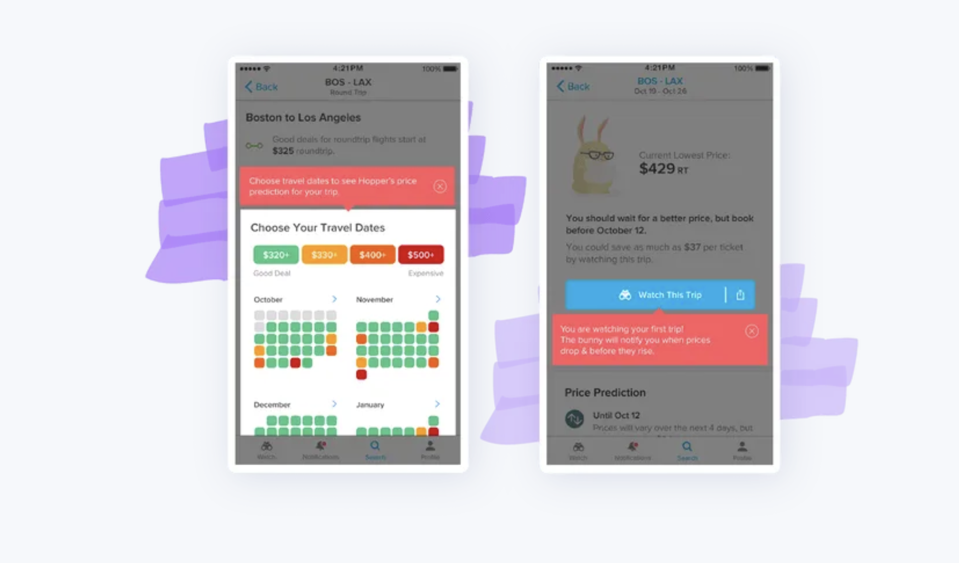
Hopper, an app designed to help you find the best prices on hotels and flights, offers a great example. Booking a flight or hotel is the ultimate conversion, but booking a trip is too big a commitment to expect from most first-time users. It's too early in the relationship. Instead, Hopper prompts new users to first "watch" a flight or hotel: a low-effort, high-value action that signs up the user to be notified when prices hit a predicted low within their selected date range. There's no risk for the user, and it's easy to do in just a few steps within minutes of opening the app.
By prioritizing the "watch" action first, Hopper proves immediate value, keeps the user engaged over time, and ultimately increases the user's likelihood of booking travel. All before the user has spent more than a few minutes in the app.

The time it takes for a new user to recognize the value of your product or service is called Time to Value (TTV). When it comes to user onboarding, your goal should be to shrink your users' time to value.
Once you've identified the activation moment and how long it takes to reach it, you can work backward to define the other relevant milestones for your users on this journey. Reducing time to value starts with eliminating the things that are standing in the way. Unnecessary friction is the number one cause of death for momentum.
The following is a simple but powerful 4-step process that's helped mobile app teams improve their mobile onboarding experience.
Start by identifying the one action that represents the most pivotal part of your users' journey: the moment they first discover the product's value. A good range to aim for in getting users to that action is anywhere between 3 to 7 steps. Having too many steps will overwhelm users or obfuscate your main point.
At Hopper, they narrowed their list down to just 3 steps that users need to do to perform the key action: search for an origin and destination, select travel dates, and press the watch button on the prediction screen.

Once you've identified a key user action to focus on, make sure your product is as supportive of your onboarding journey as possible. Make a list of the steps users currently have to take to perform these key actions. Then, either remove steps or make the intended actions clearer or more compelling along the way.
For Hopper, this required ensuring that the search screen was the first screen users saw on install, the search action was obvious to perform, it was clear how to select dates, and the watch button was the most prominent CTA on the prediction screen. Removing friction from the path to the key action required altering existing layouts, interfaces, and interactions.

When you feel your app is doing the best it can to help drive first-time users to ideal behavior, test it. Put it in front of people and see where they get distracted or confused.
Testing your onboarding experience with real users in real-time will help surface the ways you can drive them toward action more effectively. Testing doesn't need to be incredibly time-consuming. You'll likely pick up on important trends pretty quickly, in some cases in as few as 5 user tests.
Use what you learn to fill in the onboarding gaps left in your product with new UI patterns specifically designed for first-time users. At each of the 3 steps in their onboarding flow, Hopper points out a single action that would move the user to the next screen. Their team found that by highlighting and providing context for the key action (i.e., "Choose Your Travel Dates" and "Watch This Trip"), they were able to increase the percentage of new users who progressed to the next step.
Based on user reports and analytics, continue to track and measure how easy it is for users to perform the key app action and refine your flow further in steps 2 or 3. Creating a user onboarding experience isn't that different from building your product as a whole. You should be prepared to hypothesize, iterate, test, and adapt quickly based on what you learn.
When people talk about mobile app onboarding, we tend to picture the conspicuous visual elements, or user interface (UI) patterns, commonly used to guide and nudge users toward value. These patterns are widely adopted for a reason: they work.
But before diving in, a word of caution: there's no such thing as a "silver bullet" when it comes to user onboarding. Just because the following approaches work for many apps does not mean they'll work for yours. Simply adding a specialized UI pattern to a broken onboarding experience won't magically fix everything.
Consider these common mobile onboarding UI patterns as tools at your disposal, if and when they're called for. You should always test to determine which onboarding UI patterns are right for your users and your app. Then, test some more.
An app that doesn't get its point across quickly is an app that doesn't succeed. Tailoring the experience right out of the gate gives users more incentive to stick around, since they know the content in your app will be relevant to them. That's where the full-screen takeover truly shines.
The welcome screen is one of the most common and compelling use cases for full-screen takeovers. Acorns, an investing app, employs a full-screen takeover to highlight the app's value and provide users with a clear understanding of how they will benefit.

Albert, a mobile-first financial savings app, uses a full-screen takeover to highlight the value of opting into text alerts.

Tips for full-screen design:
Mobile modals are an extremely versatile UI pattern. Beyond the initial onboarding welcome message, modals are perfect for delivering important announcements to existing users: new feature announcements, product upsells, marketing campaigns, or essential permissions requests. Basically, anything really high-stakes or high-profile.
Skyscanner, an app that helps people find cheap flights and hotels, uses a standard modal pattern to grab users' attention and provide information about their data privacy options.
Tips for mobile modal design:
Like standard modals, banners and slides (also known as half-screen or cover sheet-style modals) overlay the base UI of the app. When used correctly, these patterns are great at notifying users about important information in real-time, without disrupting their entire app experience. Uber Eats uses a rounded, half-screen slide-up to welcome new users with a discount code.
Tips for banner and slide design:

No matter how intuitive your mobile app, employing UI patterns can help. Nudging users to take action or shining the spotlight on a new feature will improve their chances of realizing value and the chances they remain active users of your app.
Duolingo employs a spotlight pattern to draw attention to their "PLUS" button and highlight the benefits of Duolingo Plus (its premium, paid version of the app). Targeted at users of their free plan, this approach ensures everyone is aware that Duolingo Plus exists, and makes it easy to learn more.

Tooltips are much less common in mobile apps than web-based apps, largely due to limited screen real estate. But they can be effective mobile adoption tools when used sparingly and thoughtfully. Yahoo Sports' mobile tooltip encourages users to take advantage of the Watch feature when it's most useful: when a game is live.

Tips for designing mobile nudges, spotlights, and tooltips:
Onboarding checklists help users complete the needle-moving tasks within your app. This UI pattern is perfect for injecting a dose of gamification into your app and can provide the motivation users need to finish multi-step onboarding processes.
Checklists work because they break complex processes down into easy-to-accomplish tasks. The familiar list format helps users visualize exactly how many steps are left before reaching the finish line. Tandem, a language learning app, is a perfect example of an onboarding checklist in a mobile app. Their checklist is easy to find from the main dashboard thanks to a persistent, unobtrusive progress bar.
/

Tips for onboarding checklist design:
Gaining access to your mobile app users' data requires a delicate balance of timing and education. Mobile app users are increasingly hesitant to grant apps permission to access their personal information.
For those who work in the mobile space, that's a chicken-or-egg type of problem. Users might need to grant access to their data before your app will work fully and correctly, but asking them to grant that permission requires trust. And that trust takes time to build, but users will abandon apps that take too long to set up.
You wouldn't propose marriage on the first date. Why would you badger users with the big ask before demonstrating some kind of value?
Permission priming is the act of building value and trust with users before asking them to grant the permissions your mobile app needs. Done well, it lowers abandonment rates while increasing trust.
Timing is everything. Avoid asking for access until you truly need it.
The one exception? If permission is critical to the functionality of the app. Navigation app Waze, for example, asks the user for location access immediately after the app is opened for the first time. Since this ask is critical (it's impossible to offer accurate directions if you don't know where the user is) and contextual (the user knows Waze is a navigation app before installation), people are more likely to grant the request.

Secondary permissions (those that aren't critical to the app's functionality) are best tied to a particular task or feature. Only ask for access once the feature is used for the first time. Users are much more likely to grant the request when actively trying to use a particular feature.
Language learning app Babbel offers a great example. They don't ask for microphone access during the initial onboarding lesson. They let users see the value of the app first. But once users reach the point in regular lessons where speaking practice is an option, they're asked to grant the app access to their mic. This request works because it's contextual, users are motivated, and they have the chance to decline it if they prefer.

Your onboarding sequence is an excellent opportunity to educate users and demonstrate the benefits of your app. You should approach permission priming in the same way. Each time your app requests a new permission, it's important to make clear to the user why the request is being made and what benefits the user will get in return.
In their onboarding videos, personal training app Zova explains how push notifications will unlock daily health and fitness videos and nutrition tips, helping users get more value from the app.

Starbucks uses a modal to explain how turning on location services allows users to quickly find nearby stores and access regional menus. By providing context and education to prime users before requesting access, both Zova and Starbucks turn big asks into thoughtful requests.

Making permissions optional goes a long way toward building trust and putting users at ease. Some users will inevitably deny a permission request, and it's essential you handle those denials effectively.
Whenever a user denies a permission request, describe the effect their refusal will have and the benefits they'll forgo by denying permission. Scooter rental app Bird, for example, cannot run without access to the users' location. If a user denies location access, the app displays a warning explaining the problem, and prompts users to allow location access before letting them continue.

Meditation app Headspace relies on push notifications to help users form beneficial meditation habits. But instead of forcing users to enable notifications, Headspace reminds users of the benefits they're missing out on at the end of each meditation session and allows them to opt into notifications and reminders. Don't overlook permissions optimization as a way to truly enhance the user experience and add value.

At the end of the day, we spend a lot of time with our favorite apps. Taking the time to respect your users' boundaries can go a long way toward building the type of good will that turns regular users into raving fans.
Think about the last few push notifications you received. Were they relevant? Did they inspire you to click through? Push notifications are the Jekyll and Hyde of the mobile marketing world. When done effectively, they're one of the most powerful tools at a marketer's disposal, allowing you to re-engage with users outside of the app. When misused, they are disruptive and can even turn users off your app permanently.
Despite their potential to be polarizing, push notifications are a critical element of every mobile marketing strategy today:
Push notifications are not separate from onboarding. They're how you continue guiding and re-engaging users after they leave the app.
The single most important element of your push notification strategy is personalization.
Segmentation and personalization are like steroids for your mobile app onboarding experience. If you're going to interrupt someone, you better have something good to say, and by good, we mean both compelling and relevant to the end user.
To accomplish a personalized push notification strategy, you need to capture deep user insights. Great push notifications rely on both profile (demographic info that a user or autocapture provides) and behavioral (actions a user takes within your app) data. This ensures each push you send is hyper-targeted to the end user.
Peloton's push notification exemplifies this approach: after a user finishes a class, it uses profile and behavioral data to craft an engaging message tailored directly to the end user.

While push notifications occur outside the app, a big part of their success is owed to the in-app messaging that appears on the onboarding UI patterns, like modals. Push notifications should link users directly to a relevant in-app message. In-app messages bridge the gap between external and internal communication channels to provide a seamless user experience.
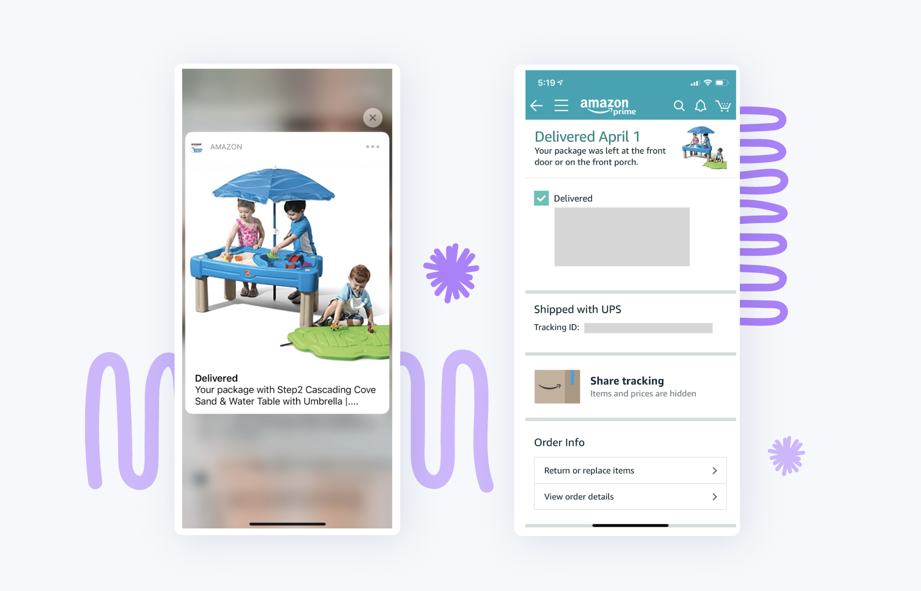
Imagine you see a push notification about delivery information that brings you to a product page to buy more of the same product. Sure, it might encourage more repeat buyers. But this bait-and-switch approach will more likely annoy users so much that they turn off all notifications from your app.
Amazon takes an entirely different approach. They use triggered push notification campaigns to let users know when their package is delivered. Once a user opens the notification, they're connected to a page with delivery information. At the top of the page is a mobile banner with detailed information regarding the delivery. Put together, these mobile marketing tools help create a frictionless user experience that inspires both engagement and retention.
A great push notification connects with users by tailoring the message to their individual needs, preferences, and use case. Once inspired to swipe through, a product-led application will continue the momentum by providing frictionless, personalized experiences that lead users to value.
Spotify offers a quintessential example: they've perfected the art of leveraging user data to provide a hyper-personalized user experience that repeatedly leads users to value and only gets better with time.

Powerful push notification strategy starts with tailoring the message to the individual user. Simply throwing someone's name in a message is not smart personalization, and your end users will see right through it. Instead, use a combination of robust user data and marketing automation to build a compelling strategy that addresses user needs at the right moment in their journey.
Push notifications are one of the most effective tools in mobile marketing today, but they don't work well on their own. Make sure whatever message you're conveying is reflected in the subsequent in-app experience.
The reports and metrics in this section should give you a perspective on opportunities to improve your app's onboarding experience.
How do you know your onboarding process isn't sending users away? One oft-overlooked tool is action cohorts, a visual that shows the relationship between one event in the app and another.
For example, you can set a filter to see how many users signed up for the app and then went on to complete a purchase in the same week. This approach gives you more actionable insights than simply looking at retention and acquisition rates, drilling down to every single action in the onboarding flow.
Ideally, you want to identify one to 3 key user actions in your mobile app that you want your users to take. Then, you can use action cohorts to track those flows over time, discover the drop-off points, and zero in on areas that will most significantly improve your mobile onboarding.

Getting users to their aha moment is only half the job. The other half is making sure they come back.
Daily Active Users (DAU) is helpful for knowing whether people are using your app regularly. Calculate DAU by looking at the number of users who opened the app in a given day.
Monthly Active Users (MAU) is the unique number of people who use the app over the course of a specific month or 30 days.
You can also use DAU and MAU numbers to calculate stickiness: how often people come back to the app. To calculate your app's stickiness, divide DAU by MAU to get a percentage. The higher this percentage, the more often users are returning. Highly sticky apps are those whose monthly average users come back often.

User gestures in apps are more complicated than equivalent clicks on a website or desktop app, but they reveal much more about how users interact with your mobile app.
Touch heatmaps show a map of the aggregate gestures users make on each screen of your app, allowing you to see where users are touching the screen most. Critically, you can even view the unresponsive gestures that might be ruining your users' experience.
Unresponsive gestures are some of the most frustrating things users encounter in mobile apps: The user taps or swipes the screen, expecting it to behave in a certain logical way, and it just doesn't. What tends to follow? They quit the app forever.
Touch heatmaps help you expose the cracks in your app's infrastructure quickly by hunting them down and telling you where they're hiding.
Apps should track their onboarding funnels to understand why users are dropping off, and identify friction points before guessing at solutions. Key metrics to watch:
Activation rate: The percentage of users who reach the activation event. This is the single most important onboarding metric. Tie it to a specific behavior that signals real value beyond account creation or setup. If your rate is low or activation itself is slow, the onboarding process isn't doing enough to guide users to the right actions.
Time to Value (TTV): The gap between signup and activation. The longer that gap, the more opportunities there are for confusion, distraction, or drop-off. Shortening TTV often has a bigger impact than adding more onboarding steps.
Daily Active Users and Monthly Active Users: Proof that onboarding is building habitual use, not just one-time engagement.
Stickiness: The ratio of DAU to MAU. The closer these numbers are, the more often users are returning.
The principles in this guide apply broadly, but the way they play out in practice varies depending on your audience, your app's complexity, and the stakes involved for your users. If you're building or launching a mobile product in a specific industry, these breakdowns go deeper:
App abandonment is the single biggest issue for mobile app businesses. Fixing it is the key to growing an active user base and ultimately, revenue.
The most effective way to set your app apart is during new users' first experience with your app. A strong app onboarding experience leads to happy new users, higher retention rates, more organic downloads from word of mouth, and better app store rankings and visibility.
But onboarding isn't a one-time event. The best mobile apps treat every feature update, every push notification, and every contextual tooltip as another chapter in an ongoing relationship with the user. Ultimately, your aim is to deliver a memorable and delightful first impression that sets up new users for success on subsequent logins and combats app abandonment long-term.
How you do that is up to you.
Want to build mobile app onboarding that actually sticks? See how Appcues helps mobile teams create, personalize, and optimize onboarding flows, without engineering dependency.