.png)

A good idea, no matter how innovative or helpful, isn't enough to guarantee product success. The scary reality is that 90% of startups fail.
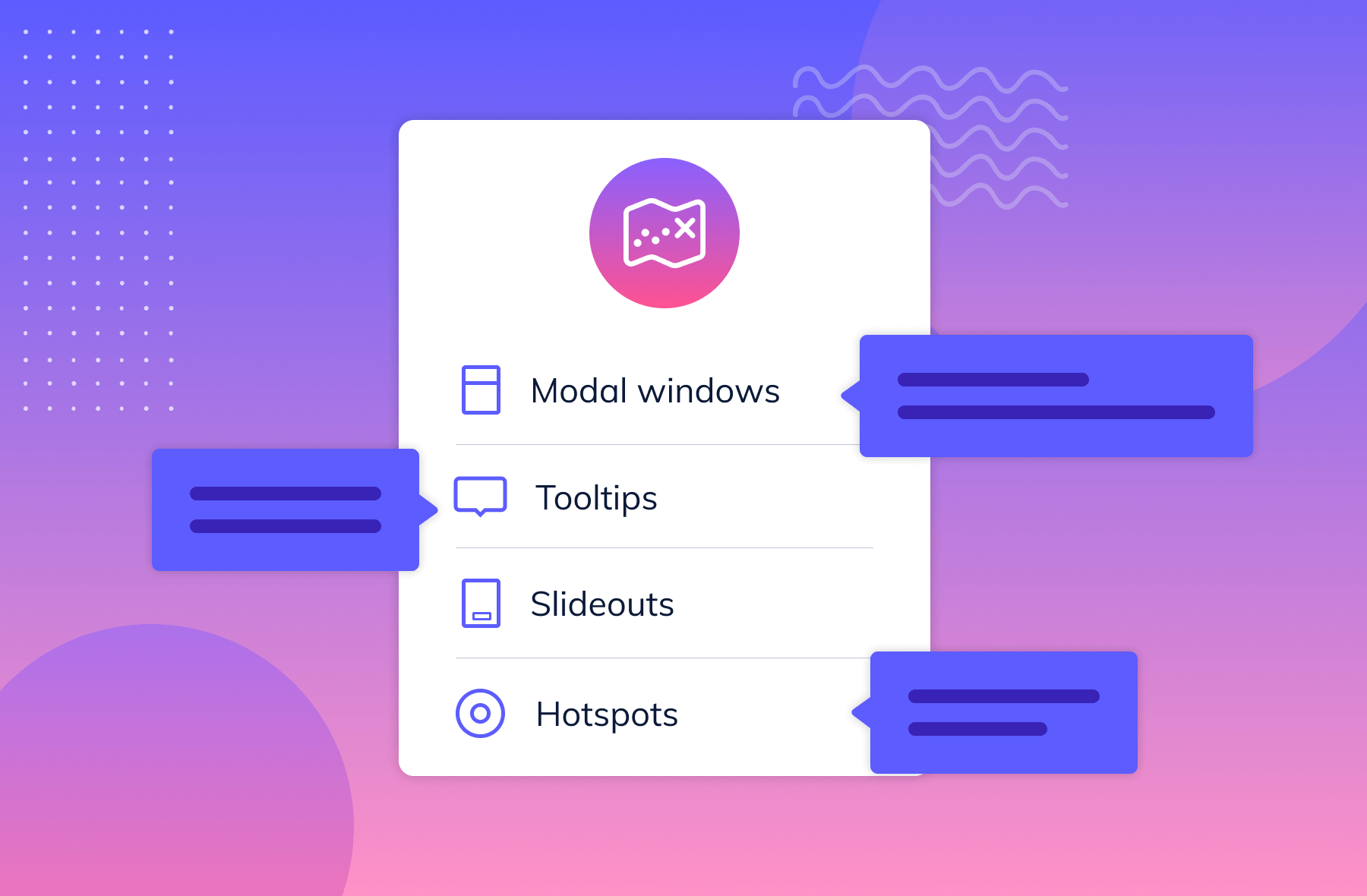
Companies succeed when they can tell their product's story clearly and deliver value without frills. Telling that story without overwhelming users often calls for a simple product design that can communicate value even at a glance.
The importance of a simple product design is evident with personal finance startups. While not as new as other tech industries, the personal finance space has been rife with competition for the past decade, with no signs of slowing down. It's filled with product design disasters that we can all learn from.
By looking at the success of Mint and Apple Pay, and the massive failures of their competition, we can take away a few dos and don'ts about telling your product's story with clear, simple design.
Wesabe and Mint were among the first web-based money management tools. But one quickly fell to the wayside while the other grew to 1.5 million users in two years and became a household name. The companies' different futures came down to who had a simpler interface that offered more value.
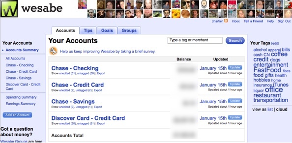
Wesabe launched in 2006. Compared to other tools at the time, Wesabe was one of the first money management tools that aggregated your data directly from your bank account, as opposed to its earlier competitor Quicken, which “started out as a blank spreadsheet requiring manual data entry.” Their interface helped pioneer how we manage our finances online.
But Wesabe had a few glaring issues. Its design was tricky. There were a ton of buttons showing you where you could view your separate accounts, but you couldn't necessarily view all of your transactions in one place. Wesabe was meant to show you a complete vision of your finances, but that vision is vastly incomplete if it doesn't show you how much you're spending.
Also, Wesabe advertised itself as a partial-social networking tool, hoping to jump on the “social” bandwagon. That's an awkward concept when considering your finances and sensitive information.
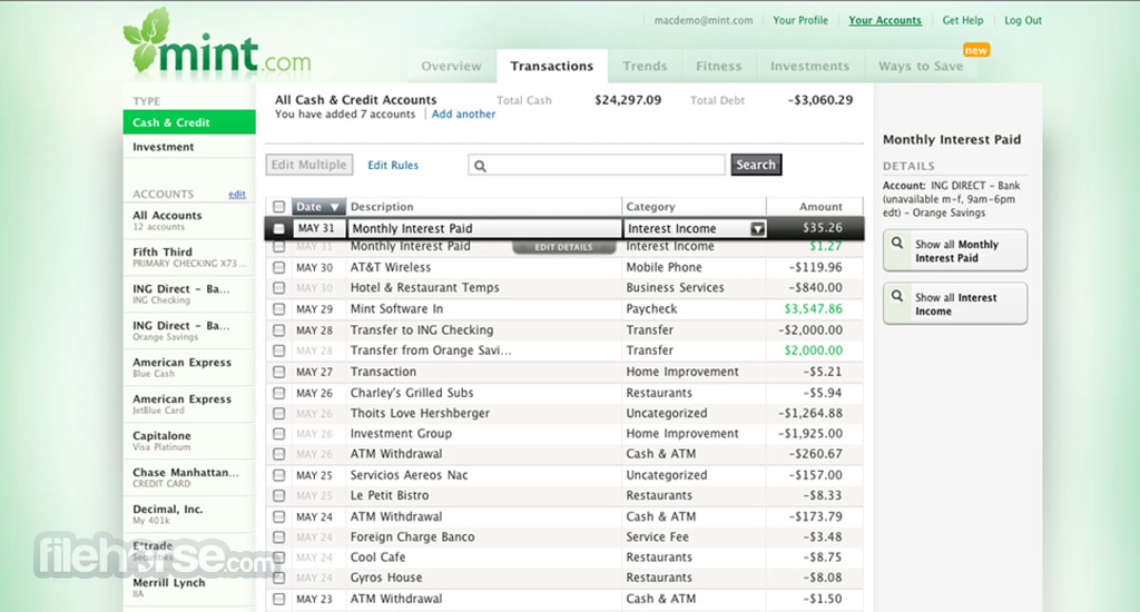
Mint launched in September 2007, at the TechCrunch 40 conference, and it brought the key concept behind Wesabe (putting all of your financial data in one place) to a whole new level.
Mint users could not only see all of their transactions in one place, under the “Transactions” tab, but they could categorize their expenses based on items like “Rent,” “Coffee shops,” “Charity,” “Personal care,” and so forth. It also visualized their spending, gave advice for long-term financial planning, and synced with student loans programs so that its users could get the most complete version of their finances.
In 2009, Mint was acquired by Inuit (which made TurboTax and QuickBooks) for $170 million. A year later, Wesabe closed shop.
Mint took Wesabe's idea, but trimmed the fat in Wesabe's features. Instead of the “social networking” aspect, Mint offered analytics of their users' spending and a complete vision of their finances. Mint succeeded because it gave users something that they wanted, needed, and made it easy to navigate.
But above all, Mint provided more value to its users than Wesabe did. Their product saved users time that they would have otherwise spent checking their account balance, or logging into multiple accounts to view their investments. Mint was far more detailed and more interactive than Wesabe had ever been, and empowered users to feel like they were in control of their finances. They could make smart decisions with all the important material in front of them.
Don't Expect Users to Jump Hurdles Just for a Good Idea
Both Pay By Touch and Apple Pay sought to reduce the number of steps you take to complete a purchase in-person.
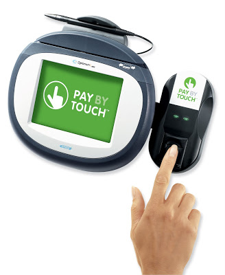
Like Mint and Wesabe, Pay By Touch (2002-2008) was a pioneer in web-based finance tools, but one that let you complete purchases with the touch of your finger. It had $340 million in funding and was lauded as futuristic and visionary.
While the idea was novel, its execution was weak.
Pay By Touch assumed that its idea was compelling enough for users to adopt, despite not integrating with existing payment systems and devices. They soon found out that people don't readily trust something at the grocery store that they need to use their fingerprint on.
At the end of the day, there were no real overhauls in security, and Pay By Touch didn't even work reliably when people went to complete their transactions.
On the other hand, Apple Pay launched in 2014, and can be accessed through Apple devices. Users can pay for items by using the Touch ID they use to log into their device, and simply holding their phone up to a sensor at tons of stores. It's also more secure than other pay-and-go services: it doesn't share users' credit card information with other businesses, and the Touch ID ensures that only you can complete those transactions.
While the idea of a digital wallet sounds somewhat less exciting than Pay By Touch's biometric payment, Apple Pay is integrated with something that we all have on us all the time—our smartphones. Taking out your phone that already stores and protects your data to pay for something just doesn't seem like a huge leap.

If Pay Per Touch had taken off, it would have required an entire industry overhaul, for the sake of simplifying everyday transactions. It also linked your biology directly to your credit card, which needed to be more secure than Pay Per Touch worked towards in practice. Even with those issues aside, Pay By Touch just didn't work reliably.
On the other hand, Apple Pay was built specifically for iOS. It rarely glitches and makes user security a priority. This has made Apple Pay into the staple tool for purchasing items on the go.
Just because your product is built around an innovative idea doesn't mean that users will adopt it. As Simon Sinek said, “people don't buy what you do; people buy why you do it.”
At the end of the day, your minimum viable product shouldn't just work better than those of your competitors. You also have to tell your product's story better with simple design and a clear value proposition.