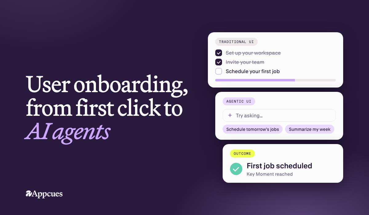


User onboarding is the process of getting a new user from signup to their first real outcome in your product, and then to the habits that keep them coming back. It includes the setup a product asks for, in-product guidance such as welcome screens, tours, checklists, tooltips, and AI assistants, plus follow-up messages that bring users back to finish. For product managers, product marketing, and lifecycle teams at mid-market and enterprise SaaS companies—especially product-led organizations focused on onboarding, feature adoption, and retention—this is one of the cheapest levers for improving activation and keeping users from churning before they ever see value. This guide breaks down onboarding fundamentals, flow design, best practices, AI feature onboarding, measurement, common mistakes, emerging patterns like agentic and zero UI, and how Appcues helps teams act on all of it.
Customer onboarding is the account-level process: kickoff calls, implementation, data migration, training. It's usually run by CS or services, and it's measured by time to go live.
User onboarding is what each person experiences inside the product. It's usually run by product and marketing, and it's measured by how many users reach their first outcome.
B2B products need both. User onboarding is the half that scales. It reaches the thousandth user at a customer's 40th location, the one who never joined a kickoff call.
Most onboarding journeys have the same four stages:
Most drop-off happens between setup and first outcome, and that's where onboarding earns its keep.
Onboarding is the cheapest place to fix retention. A user who never reaches value doesn't churn at renewal. They churn in week one, and they don't tell you why.
Good onboarding moves the numbers that leadership watches: activation rate, time to value, trial-to-paid conversion, early retention and, eventually, net revenue retention. Poor onboarding shows up as the opposite: users who sign up and never return, accounts with seats nobody uses, and renewals that turn into downgrades.
Three things have raised the stakes in the last year:
Products are getting more capable faster than users are learning them. Onboarding closes that gap.
Users didn't sign up to learn your navigation. They signed up to get a job done and reach the core value that made them choose your product, not to learn the interface. Every onboarding step should move them toward that job, and anything that doesn't can wait.
Each required field, setting or decision before the first win is a reason to leave. Pre-fill what you can, offer sample data, and use progressive disclosure: show the next thing only when the user needs it. When possible, defer account creation or delay account creation steps like email verification until after users see value, since delayed email verification increases user retention rates.
A dealership GM and a service advisor in the same account need different first sessions, and so do a managing partner and a paralegal. For effective onboarding, segment users by role, goal, and user behavior before deciding which guidance appears for different user groups. In fact, 31% of companies use personalization in onboarding processes.
When a user does something that matters, show them the result and why it matters so users feel progress early and often, not just activity. Value that users can't see doesn't keep them.
This principle has become essential with AI. Show users how a result was produced, let them preview and undo, and keep people on the decisions that carry consequences. Hand over more to the product as trust builds.
The most common onboarding mistake is building a feature tour. Users don't sign up because they want to see your feature list — they sign up because they have a problem they need solved.
The best onboarding experiences are built around the user's desired outcome. Every step should be framed in terms of what the user gets, not what the product does. "Set up your first project" lands differently than "Explore the project management module." One is about the user. The other is about the product.
Before you design a single onboarding step, ask: what does this user actually want to accomplish? Then build a path that gets them there.
Every unnecessary step in your onboarding flow is a potential exit point. Unnecessary form fields, mandatory tutorials, information overload — all of these cause drop-off before users ever reach value.
The principle of progressive disclosure is your guide here: only ask for what's necessary, when it's necessary. Don't collect information you don't need at signup. Don't show users features they won't need for weeks. Surface complexity only when the user is ready for it.
To audit your onboarding for friction, walk through it as a new user and ask at each step: is this required for the user to reach value? If the answer is no, cut it or move it later.
One-size-fits-all onboarding consistently underperforms. A marketing manager and a software developer signing up for the same product have different goals, different vocabularies, and different definitions of success.
Segmenting users by role, use case, company size, or stated goal allows you to deliver guidance that feels relevant rather than generic. This can be implemented through welcome surveys that collect context on day one, conditional flows that branch based on user attributes, and dynamic content that adapts to what you know about the user.
Personalization doesn't have to be complex to be effective. Even a simple two-path flow — one for individual users, one for teams — can meaningfully improve activation rates.
Users need to feel progress. Quick wins — small, early moments of success — build confidence and momentum that carry users through the harder parts of onboarding.
If a user can accomplish something meaningful in their first five minutes, they're far more likely to come back. That "something meaningful" doesn't have to be the full aha moment — it just has to feel like a step in the right direction.
This connects directly to time-to-value. The faster you can show users a result, even a small one, the more invested they become in seeing what else the product can do.
Product tours and interactive walkthroughs are two common onboarding patterns for guiding users through key actions. Good tours are short and tied to one action. Bad ones march users through every feature until they skip or abandon it. Contextual walkthroughs, which trigger when a user reaches a relevant moment, almost always beat a forced tour on first login. Users skip long tutorials, so the best onboarding flows keep tours brief and relevant. Keep a tour to the minimum needed for the first key action. More: product tour UI patterns.
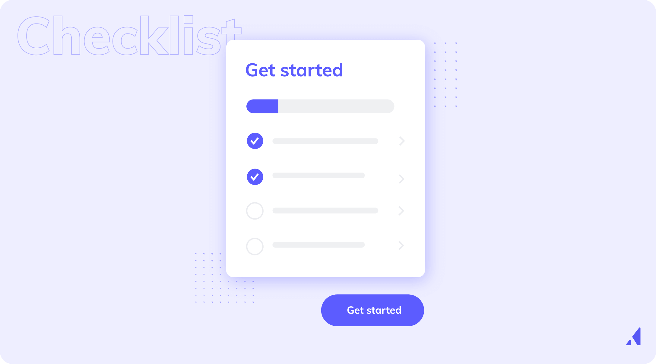
One of the most useful onboarding checklists helps guide users through a clear sequence of next steps because people want to finish what they've started. Keep them to 3 to 7 items, order them by the value each delivers rather than by technical sequence, and make each one doable in a single session. They work best when they show only what users need to do next, rather than everything at once. A checklist that starts partly complete builds momentum early.
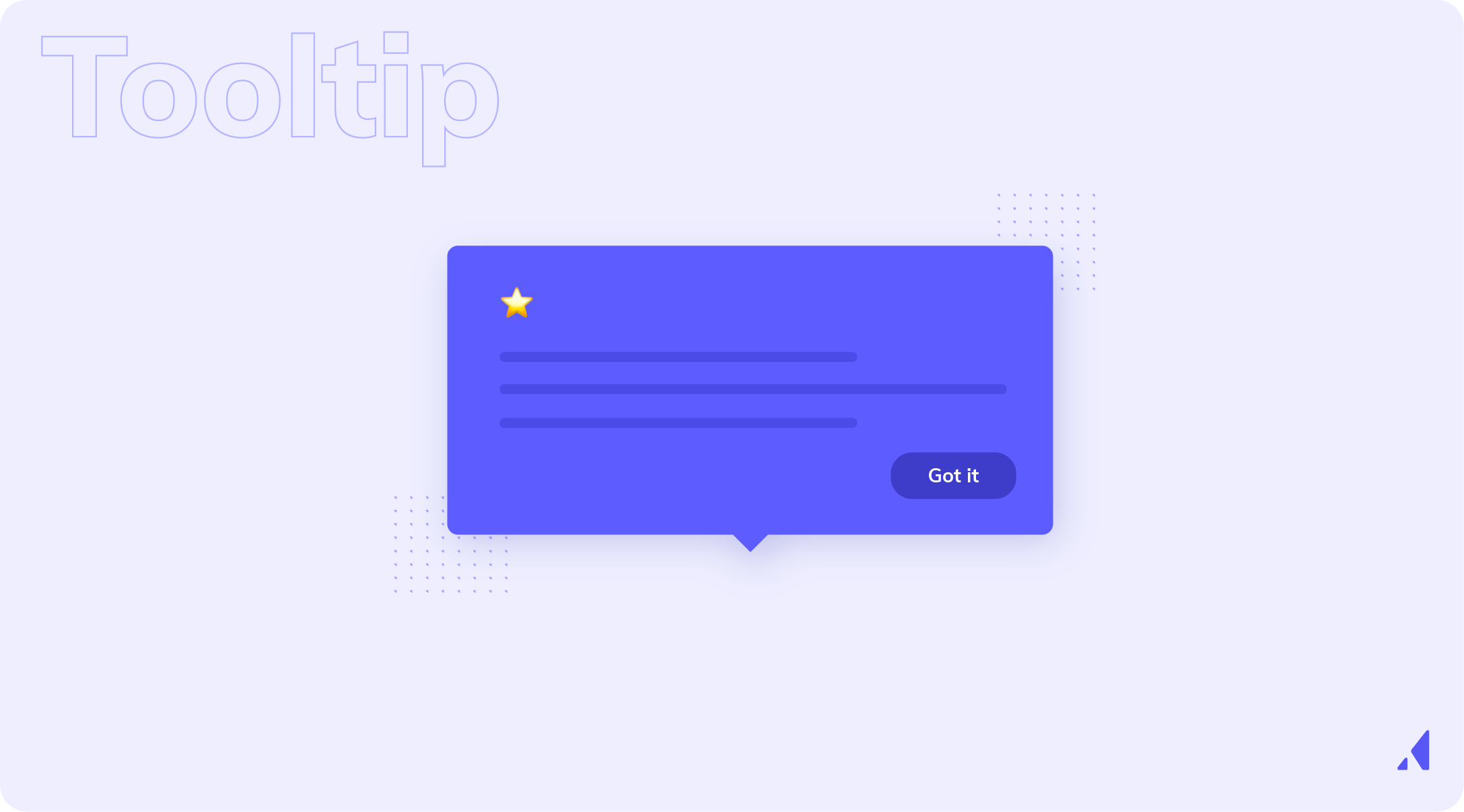
Tooltips and hotspots put guidance exactly where it's needed, and can prompt users toward the next action while keeping the interface uncluttered. Proactive tooltips fire on behavior, such as a first visit to a page. Reactive ones appear on hover or click. Use them for secondary features and confusing UI, not for introducing core concepts. In Appcues, you build these as Tooltips and Pins. More: tooltips. They also work well as in app guides when the goal is to walk someone through a specific workflow rather than explain every feature.

An empty state is what users see before they've added anything. It's one of the most underused onboarding moments. A good one says what to do next, shows what the screen will look like once they do, and offers a single clear call to action, ideally with a sample or template.
Modals help or annoy depending on timing and relevance. Lead with a specific headline, keep the body to one or two sentences, offer one obvious CTA, and never stack modals one after another.

This is the newest onboarding surface, and the one most products get wrong. An assistant that opens to "Ask me anything" leaves new users with nothing to do, while users engage more when starter prompts are tied to their role and current task. Open it with starter prompts based on the user's role and the page they're on, and guide the first run toward a result the user can check. See how to onboard users to AI features below. Then introduce advanced features gradually, once they’ve gotten a first result they can trust.
Users rarely finish onboarding in one session, so onboarding emails help engage users after the first session, especially when they have not yet reached value. Behavior-triggered emails, push and SMS bring them back to the next step. Timely follow-up can help users complete the next step after they stall. "You're one step away from [specific outcome]" beats "Come back to our product" every time. In-app guidance leads. Other channels coordinate with it, so users get consistent guidance, not duplicate or contradictory messages.
Before you design anything, decide what "activated" means by defining the activation milestone onboarding is trying to reach. Logging in doesn't count. Look at your retention data: what did users who stuck around do in their first session or first week that churned users didn't? Cohort analysis answers that. The answer becomes the target of every onboarding decision.
Map every step a new user takes in the onboarding journey from signup to first outcome, using real analytics and session data, not memory. That user journey shows the gaps, the unnecessary steps and the points of confusion, as well as where users already succeed.
Each drop-off point is a fixable problem. Use funnels and session recordings to see where users drop and which steps create the most friction: confusion, an error, an unclear next step, or too much friction. Fix the step where the most users leave first. A small gain there outweighs a big gain anywhere else. Then go through your own onboarding to catch confusing instructions or dead ends the data alone may miss.
A one- or two-question welcome survey gives you enough context to build separate onboarding flows or tailored onboarding paths for different roles or goals. That split helps guide users to the product’s core workflow faster. Two or three paths, based on the biggest differences in your user base, usually beat one generic flow by a wide margin.
Teams should treat onboarding as ongoing optimization, not a one-time build. A/B test welcome copy, checklist structure and triggers. Review key metrics like activation, time to value, drop-off, feature adoption, and user retention at Day 1, Day 7, and Day 30. Review performance monthly or quarterly, and again every time the product changes. The teams that win at onboarding keep improving it over time.
There's no single right way to onboard. What we've seen work over more than a decade depends on the product, the user's goal and the moment they're in. Teams that onboard well don't improvise. They work from a small set of plays, tested and refined over time.
Most onboarding experiences can be built from five plays. Each one answers a different question the user is asking:
When an onboarding flow fails, the cause is usually an unanswered question on this list, not a lack of UI polish.
For a full comparison, see our list of the best user onboarding tools.
The short list. For ten strategies in depth, see user onboarding best practices.
The feature dump is the most common anti-pattern: every capability, shown before the user has seen any value. Replace it with progressive guidance that appears when it's needed, because users tolerate far less friction when onboarding feels like a feature dump instead of timely guidance. Pre-populated examples also help users learn faster than a blank workspace can.
Small screens, touch targets, and divided attention make mobile app onboarding a different job, and the choices you make in that first session can shape long-term retention. Design mobile onboarding from scratch. App onboarding should keep onboarding screens short and focused on one purpose each. Don't just shrink the desktop flow.
Products change, and onboarding that was right six months ago may now mislead users. Treat it as a living system with a regular review.
Users back after 60 days away, users who just upgraded, and users meeting a new feature all need their own guidance. These flows get neglected, and they're some of the best retention opportunities you have.
A modal saying "Meet our new AI assistant" gets clicks, then usage fades. Users adopt AI in stages: they try it, trust it, then rely on it. Each stage needs its own guidance, shown at the moment of the task the AI replaces.
Onboarding an AI feature isn't harder than onboarding any other feature. It's different, in five ways.
The aim changes from teaching the interface to getting users to a first result they trust.
Most teams track the wrong thing: the key metrics for onboarding should connect flow completion to whether users complete meaningful work and come back. That measures the flow, not the user. Measure outcomes instead, as a ladder. Each rung is harder to fake than the one below.
Retention at Day 1, Day 7, and Day 30 is one of the clearest signs of whether onboarding actually worked.
If reach climbs while habit stays flat, people noticed the launch but didn't adopt it. Fix the first-value rung before you write another announcement.
For formulas and benchmarks for each metric, see user onboarding metrics and KPIs.
Onboarding is where customer growth starts. In the agentic era, it's getting harder both to see and to act on. Appcues gives you insights that act for you.
An intelligence layer shows how users behave, feel and react, in your UI and in conversations with your agents. An agent team turns those signals into personalized experiences and outreach wherever customers are: in-app, in your agents, and in email, push or MCP. Product teams get recommendations to improve onboarding. Go-to-market teams run targeted outreach without waiting on a handoff.
The result is self-driving adoption, which accelerates your customers' velocity: more value, faster.
Key Moments are named milestones, such as "first job scheduled" or "first AI summary accepted". You define each one once from events and user conditions, then reuse it for targeting, objectives and dashboards. Every onboarding experience is measured against the outcome, not the click-through.
A Campaign is one goal. Its Tactics are the different ways of getting there, each with its own audience and messaging: Flows, Checklists, Pins, Embeds and Banners. Campaign dashboards compare users who saw an experience with users who didn't, so you can tell what actually moved them.
Hand Appcues AI a mockup, a page or an old Flow, and it drafts the experience. Your team edits it, and nothing goes live until someone publishes it. Appcues also watches live experiences and flags when one starts failing, with a suggested fix.
The Appcues MCP Server (beta) lets your team build experiences from Claude, ChatGPT or Cursor. Appcues meets you wherever you are: in a traditional UI, an agentic UI and, coming soon, zero UI.
When a user struggles, in a Flow or in a conversation with your in-app agent, Appcues gets the right person involved faster: CS, support or the account owner, while the customer is still there.
The intelligence that powers the Appcues agent team doesn't stay locked in Appcues. Push it to your own agents through MCP, or to go-to-market tools like Zapier, and keep it flowing between Appcues and your systems of record.
e intelligence that powers the Appcues agent team doesn't stay locked in Appcues. Push it to your own agents through MCP, or to go-to-market tools like Zapier, and keep it flowing between Appcues and your systems of record.
Editor: agent-to-human handoffs and open intelligence come from H2 Messaging and the October ICP, not the changelog. Confirm what's available today before publishing.
Three classics that still hold up. For more, current as of 2026, see our roundup of user onboarding examples.
Asana's tour moves forward only when the user acts. Each pulsing hotspot asks them to click the thing it points at, and the tour ends with their first task created, which is a clear first outcome. A final tooltip shows where to find help next time, which cuts future support load.
Grammarly gives new users a demo document full of fixable mistakes. Hotspots reveal one feature at a time, and fixing one error leads into the next feature. You learn to use the product by using it, in a safe place where you can't break anything.
Duolingo starts with a lesson and ends with the signup form, a pattern called gradual engagement. Users pick a goal, finish a short exercise, and watch a progress bar fill. By the time it asks for an account, users sign after they’ve already experienced value, so signing up feels like a small step, not a hurdle. Delaying signup can also help more people complete onboarding by asking for commitment only after the first win.
User onboarding gets new users to their first real outcome, and keeps doing it every time you ship. The fundamentals haven't changed: define the outcome, learn who arrived, remove friction, guide in context, and follow up. AI features change the details, because the blank prompt, output that varies and the question of trust each need new patterns. Agents change what you aim at: outcomes over clicks, for people and for agents.
Shipping fast doesn't fix onboarding. Shipping AI faster than customers can trust it just leaves more of it unused.
Ready to see how Appcues drives customer growth in the agentic era? Explore an interactive demo or talk to a product specialist.
Product Adoption
Product Tours & Walkthroughs
Checklists, Tooltips & Modals
Email Marketing
TL;DR
User onboarding is the process of getting a new user from signup to their first real outcome in your product, and then to the habits that keep them coming back. It includes the setup a product asks for, in-product guidance such as welcome screens, tours, checklists, tooltips, and AI assistants, plus follow-up messages that bring users back to finish. For product managers, product marketing, and lifecycle teams at mid-market and enterprise SaaS companies—especially product-led organizations focused on onboarding, feature adoption, and retention—this is one of the cheapest levers for improving activation and keeping users from churning before they ever see value. This guide breaks down onboarding fundamentals, flow design, best practices, AI feature onboarding, measurement, common mistakes, emerging patterns like agentic and zero UI, and how Appcues helps teams act on all of it.
Customer onboarding is the account-level process: kickoff calls, implementation, data migration, training. It's usually run by CS or services, and it's measured by time to go live.
User onboarding is what each person experiences inside the product. It's usually run by product and marketing, and it's measured by how many users reach their first outcome.
B2B products need both. User onboarding is the half that scales. It reaches the thousandth user at a customer's 40th location, the one who never joined a kickoff call.
Most onboarding journeys have the same four stages:
Most drop-off happens between setup and first outcome, and that's where onboarding earns its keep.
Onboarding is the cheapest place to fix retention. A user who never reaches value doesn't churn at renewal. They churn in week one, and they don't tell you why.
Good onboarding moves the numbers that leadership watches: activation rate, time to value, trial-to-paid conversion, early retention and, eventually, net revenue retention. Poor onboarding shows up as the opposite: users who sign up and never return, accounts with seats nobody uses, and renewals that turn into downgrades.
Three things have raised the stakes in the last year:
Products are getting more capable faster than users are learning them. Onboarding closes that gap.
Users didn't sign up to learn your navigation. They signed up to get a job done and reach the core value that made them choose your product, not to learn the interface. Every onboarding step should move them toward that job, and anything that doesn't can wait.
Each required field, setting or decision before the first win is a reason to leave. Pre-fill what you can, offer sample data, and use progressive disclosure: show the next thing only when the user needs it. When possible, defer account creation or delay account creation steps like email verification until after users see value, since delayed email verification increases user retention rates.
A dealership GM and a service advisor in the same account need different first sessions, and so do a managing partner and a paralegal. For effective onboarding, segment users by role, goal, and user behavior before deciding which guidance appears for different user groups. In fact, 31% of companies use personalization in onboarding processes.
When a user does something that matters, show them the result and why it matters so users feel progress early and often, not just activity. Value that users can't see doesn't keep them.
This principle has become essential with AI. Show users how a result was produced, let them preview and undo, and keep people on the decisions that carry consequences. Hand over more to the product as trust builds.
The most common onboarding mistake is building a feature tour. Users don't sign up because they want to see your feature list — they sign up because they have a problem they need solved.
The best onboarding experiences are built around the user's desired outcome. Every step should be framed in terms of what the user gets, not what the product does. "Set up your first project" lands differently than "Explore the project management module." One is about the user. The other is about the product.
Before you design a single onboarding step, ask: what does this user actually want to accomplish? Then build a path that gets them there.
Every unnecessary step in your onboarding flow is a potential exit point. Unnecessary form fields, mandatory tutorials, information overload — all of these cause drop-off before users ever reach value.
The principle of progressive disclosure is your guide here: only ask for what's necessary, when it's necessary. Don't collect information you don't need at signup. Don't show users features they won't need for weeks. Surface complexity only when the user is ready for it.
To audit your onboarding for friction, walk through it as a new user and ask at each step: is this required for the user to reach value? If the answer is no, cut it or move it later.
One-size-fits-all onboarding consistently underperforms. A marketing manager and a software developer signing up for the same product have different goals, different vocabularies, and different definitions of success.
Segmenting users by role, use case, company size, or stated goal allows you to deliver guidance that feels relevant rather than generic. This can be implemented through welcome surveys that collect context on day one, conditional flows that branch based on user attributes, and dynamic content that adapts to what you know about the user.
Personalization doesn't have to be complex to be effective. Even a simple two-path flow — one for individual users, one for teams — can meaningfully improve activation rates.
Users need to feel progress. Quick wins — small, early moments of success — build confidence and momentum that carry users through the harder parts of onboarding.
If a user can accomplish something meaningful in their first five minutes, they're far more likely to come back. That "something meaningful" doesn't have to be the full aha moment — it just has to feel like a step in the right direction.
This connects directly to time-to-value. The faster you can show users a result, even a small one, the more invested they become in seeing what else the product can do.
Product tours and interactive walkthroughs are two common onboarding patterns for guiding users through key actions. Good tours are short and tied to one action. Bad ones march users through every feature until they skip or abandon it. Contextual walkthroughs, which trigger when a user reaches a relevant moment, almost always beat a forced tour on first login. Users skip long tutorials, so the best onboarding flows keep tours brief and relevant. Keep a tour to the minimum needed for the first key action. More: product tour UI patterns.
One of the most useful onboarding checklists helps guide users through a clear sequence of next steps because people want to finish what they've started. Keep them to 3 to 7 items, order them by the value each delivers rather than by technical sequence, and make each one doable in a single session. They work best when they show only what users need to do next, rather than everything at once. A checklist that starts partly complete builds momentum early.
Tooltips and hotspots put guidance exactly where it's needed, and can prompt users toward the next action while keeping the interface uncluttered. Proactive tooltips fire on behavior, such as a first visit to a page. Reactive ones appear on hover or click. Use them for secondary features and confusing UI, not for introducing core concepts. In Appcues, you build these as Tooltips and Pins. More: tooltips. They also work well as in app guides when the goal is to walk someone through a specific workflow rather than explain every feature.
An empty state is what users see before they've added anything. It's one of the most underused onboarding moments. A good one says what to do next, shows what the screen will look like once they do, and offers a single clear call to action, ideally with a sample or template.
Modals help or annoy depending on timing and relevance. Lead with a specific headline, keep the body to one or two sentences, offer one obvious CTA, and never stack modals one after another.
This is the newest onboarding surface, and the one most products get wrong. An assistant that opens to "Ask me anything" leaves new users with nothing to do, while users engage more when starter prompts are tied to their role and current task. Open it with starter prompts based on the user's role and the page they're on, and guide the first run toward a result the user can check. See how to onboard users to AI features below. Then introduce advanced features gradually, once they’ve gotten a first result they can trust.
Users rarely finish onboarding in one session, so onboarding emails help engage users after the first session, especially when they have not yet reached value. Behavior-triggered emails, push and SMS bring them back to the next step. Timely follow-up can help users complete the next step after they stall. "You're one step away from [specific outcome]" beats "Come back to our product" every time. In-app guidance leads. Other channels coordinate with it, so users get consistent guidance, not duplicate or contradictory messages.
Before you design anything, decide what "activated" means by defining the activation milestone onboarding is trying to reach. Logging in doesn't count. Look at your retention data: what did users who stuck around do in their first session or first week that churned users didn't? Cohort analysis answers that. The answer becomes the target of every onboarding decision.
Map every step a new user takes in the onboarding journey from signup to first outcome, using real analytics and session data, not memory. That user journey shows the gaps, the unnecessary steps and the points of confusion, as well as where users already succeed.
Each drop-off point is a fixable problem. Use funnels and session recordings to see where users drop and which steps create the most friction: confusion, an error, an unclear next step, or too much friction. Fix the step where the most users leave first. A small gain there outweighs a big gain anywhere else. Then go through your own onboarding to catch confusing instructions or dead ends the data alone may miss.
A one- or two-question welcome survey gives you enough context to build separate onboarding flows or tailored onboarding paths for different roles or goals. That split helps guide users to the product’s core workflow faster. Two or three paths, based on the biggest differences in your user base, usually beat one generic flow by a wide margin.
Teams should treat onboarding as ongoing optimization, not a one-time build. A/B test welcome copy, checklist structure and triggers. Review key metrics like activation, time to value, drop-off, feature adoption, and user retention at Day 1, Day 7, and Day 30. Review performance monthly or quarterly, and again every time the product changes. The teams that win at onboarding keep improving it over time.
There's no single right way to onboard. What we've seen work over more than a decade depends on the product, the user's goal and the moment they're in. Teams that onboard well don't improvise. They work from a small set of plays, tested and refined over time.
Most onboarding experiences can be built from five plays. Each one answers a different question the user is asking:
When an onboarding flow fails, the cause is usually an unanswered question on this list, not a lack of UI polish.
For a full comparison, see our list of the best user onboarding tools.
The short list. For ten strategies in depth, see user onboarding best practices.
The feature dump is the most common anti-pattern: every capability, shown before the user has seen any value. Replace it with progressive guidance that appears when it's needed, because users tolerate far less friction when onboarding feels like a feature dump instead of timely guidance. Pre-populated examples also help users learn faster than a blank workspace can.
Small screens, touch targets, and divided attention make mobile app onboarding a different job, and the choices you make in that first session can shape long-term retention. Design mobile onboarding from scratch. App onboarding should keep onboarding screens short and focused on one purpose each. Don't just shrink the desktop flow.
Products change, and onboarding that was right six months ago may now mislead users. Treat it as a living system with a regular review.
Users back after 60 days away, users who just upgraded, and users meeting a new feature all need their own guidance. These flows get neglected, and they're some of the best retention opportunities you have.
A modal saying "Meet our new AI assistant" gets clicks, then usage fades. Users adopt AI in stages: they try it, trust it, then rely on it. Each stage needs its own guidance, shown at the moment of the task the AI replaces.
Onboarding an AI feature isn't harder than onboarding any other feature. It's different, in five ways.
The aim changes from teaching the interface to getting users to a first result they trust.
Most teams track the wrong thing: the key metrics for onboarding should connect flow completion to whether users complete meaningful work and come back. That measures the flow, not the user. Measure outcomes instead, as a ladder. Each rung is harder to fake than the one below.
Retention at Day 1, Day 7, and Day 30 is one of the clearest signs of whether onboarding actually worked.
If reach climbs while habit stays flat, people noticed the launch but didn't adopt it. Fix the first-value rung before you write another announcement.
For formulas and benchmarks for each metric, see user onboarding metrics and KPIs.
Onboarding is where customer growth starts. In the agentic era, it's getting harder both to see and to act on. Appcues gives you insights that act for you.
An intelligence layer shows how users behave, feel and react, in your UI and in conversations with your agents. An agent team turns those signals into personalized experiences and outreach wherever customers are: in-app, in your agents, and in email, push or MCP. Product teams get recommendations to improve onboarding. Go-to-market teams run targeted outreach without waiting on a handoff.
The result is self-driving adoption, which accelerates your customers' velocity: more value, faster.
Key Moments are named milestones, such as "first job scheduled" or "first AI summary accepted". You define each one once from events and user conditions, then reuse it for targeting, objectives and dashboards. Every onboarding experience is measured against the outcome, not the click-through.
A Campaign is one goal. Its Tactics are the different ways of getting there, each with its own audience and messaging: Flows, Checklists, Pins, Embeds and Banners. Campaign dashboards compare users who saw an experience with users who didn't, so you can tell what actually moved them.
Hand Appcues AI a mockup, a page or an old Flow, and it drafts the experience. Your team edits it, and nothing goes live until someone publishes it. Appcues also watches live experiences and flags when one starts failing, with a suggested fix.
The Appcues MCP Server (beta) lets your team build experiences from Claude, ChatGPT or Cursor. Appcues meets you wherever you are: in a traditional UI, an agentic UI and, coming soon, zero UI.
When a user struggles, in a Flow or in a conversation with your in-app agent, Appcues gets the right person involved faster: CS, support or the account owner, while the customer is still there.
The intelligence that powers the Appcues agent team doesn't stay locked in Appcues. Push it to your own agents through MCP, or to go-to-market tools like Zapier, and keep it flowing between Appcues and your systems of record.
e intelligence that powers the Appcues agent team doesn't stay locked in Appcues. Push it to your own agents through MCP, or to go-to-market tools like Zapier, and keep it flowing between Appcues and your systems of record.
Editor: agent-to-human handoffs and open intelligence come from H2 Messaging and the October ICP, not the changelog. Confirm what's available today before publishing.
Three classics that still hold up. For more, current as of 2026, see our roundup of user onboarding examples.
Asana's tour moves forward only when the user acts. Each pulsing hotspot asks them to click the thing it points at, and the tour ends with their first task created, which is a clear first outcome. A final tooltip shows where to find help next time, which cuts future support load.
Grammarly gives new users a demo document full of fixable mistakes. Hotspots reveal one feature at a time, and fixing one error leads into the next feature. You learn to use the product by using it, in a safe place where you can't break anything.
Duolingo starts with a lesson and ends with the signup form, a pattern called gradual engagement. Users pick a goal, finish a short exercise, and watch a progress bar fill. By the time it asks for an account, users sign after they’ve already experienced value, so signing up feels like a small step, not a hurdle. Delaying signup can also help more people complete onboarding by asking for commitment only after the first win.
User onboarding gets new users to their first real outcome, and keeps doing it every time you ship. The fundamentals haven't changed: define the outcome, learn who arrived, remove friction, guide in context, and follow up. AI features change the details, because the blank prompt, output that varies and the question of trust each need new patterns. Agents change what you aim at: outcomes over clicks, for people and for agents.
Shipping fast doesn't fix onboarding. Shipping AI faster than customers can trust it just leaves more of it unused.
Ready to see how Appcues drives customer growth in the agentic era? Explore an interactive demo or talk to a product specialist.

Sign up for Quickcues and get our monthly updates!