User onboarding flows are all about getting users to that first aha moment. But far too many don’t think past that.
They get users the first aha moment, declare them “onboarded” and completely forget about them until they inevitably churn. The product team scratches their heads and go back to the onboarding drawing board. And so the cycle repeats.
Yes, the initial goal of user onboarding is to teach someone how to use your app. But if all a user has done is learned the ropes of one feature, the job isn’t done. Good user retention means going far beyond basic user onboarding. Retention has many stages, and if you want to keep your retention numbers high, you need to think about user onboarding past the first day.

User onboarding is just the first of many steps in the retention process. In order to keep users, you need to think beyond onboarding, and map out additional aha moments to drive deeper value and keep users coming back to your product again and again.
Identify Your Middle-Stage aha moments
Your first aha moment got users to understand the core value of your app. You ran behavioral cohort analysis to figure out what it was, how to really hook users and get them excited about your product. Middle-stage aha moments might be less exciting, but they’re far more important for retention.
That’s because middle-stage retention is about creating long-term engagement. As Ben Yoskovitz writes,
Most people think that the purpose of onboarding is to get people signed up to their product. Maybe they’re thinking about the first user experience too and how that (hopefully!) delights them and encourages them to keep going. But onboarding is so much more. Its real value is in improving long-term engagement.
To start, you need to run additional behavioral cohort analysis.
How to Identify Middle-Stage aha moments
Identifying correlations between behavior and short-term retention shows you the stickiest features that will hook users. Now you need to identify correlations between early behavior and long-term retention. Not the behaviors that will make them stick around for a few days, but the behaviors that will make them stick around for life.
The meditation app Calm used behavioral analytics tool Amplitude to do just this. Amplitude’s behavioral cohort analysis feature allowed them to find that users who had turned on the “daily reminder” feature were 3x less likely to churn.
Calm’s user onboarding was all about teaching users that the app’s value was that it could teach them to meditate. The retention process and later-stage user onboarding was about doubling down on that value, and showing users how to become regular meditators.
- aha moment #1: Calm can teach me to meditate!
- aha moment #2: Calm turns meditation a habit!
However you identify those middle-stage aha moments, it’s crucial to make a map of them. Good retention requires visualizing, step-by-step, how users will move from signup to becoming your best possible customer. Once you’ve identified and mapped out a route for users to take these behaviors, then you can think about ways to nudge users to take the behaviors that will help them achieve those.
StatusPage.io’s aha moment Map
StatusPage.io helps its users communicate server downtime. In their free trial, they get users to an aha moment by showing them just how easy it is to set up their own customized, accurate status page. But that doesn’t mean they’ll convert to a paid membership.
In order to combat this, StatusPage identified the ideal user behaviors in the path from download to conversion. Each stage represented an additional aha moment—an epiphany where users would realize how much value they could get out of the product. The second aha moment, for example, is all about teaching users how to incorporate StatusPage into the team workflow, which is how long-term value is really unlocked.
- aha moment #1: StatusPage makes setting up a status page really easy!
- aha moment #2: I can integrate StatusPage activity with my team chat!

Armed with their aha moment map, StatusPage could plan how they would urge users to take those actions, and when. They decided to use Customer.io, a behavior-based email client. If, after day 75, a user hadn’t created an incident template, they would get an email reminder to do so. They did whatever they could to get users to follow the map they had planned out.
StatusPage’s aha moment map worked wonders. Even 90 days in, they still see new action from users. These emails helped StatusPage increase conversion rates from a free to paid account from 5% to 12%.
Build Behavioral Bridges
Email is a great way to get users to take a certain behavior, but it’s by no means the only option. Email is what we call a “bridge,” or a way to guide users from one behavior to another. Each “bridge” corresponds to a specific feature in the map that you want them to take.
There are a lot of other ways to do this, including in-app, in push, or maybe even calling them up on the phone. Here are some bridges we’ve seen that work really well.
Linkedin’s Progress Bars
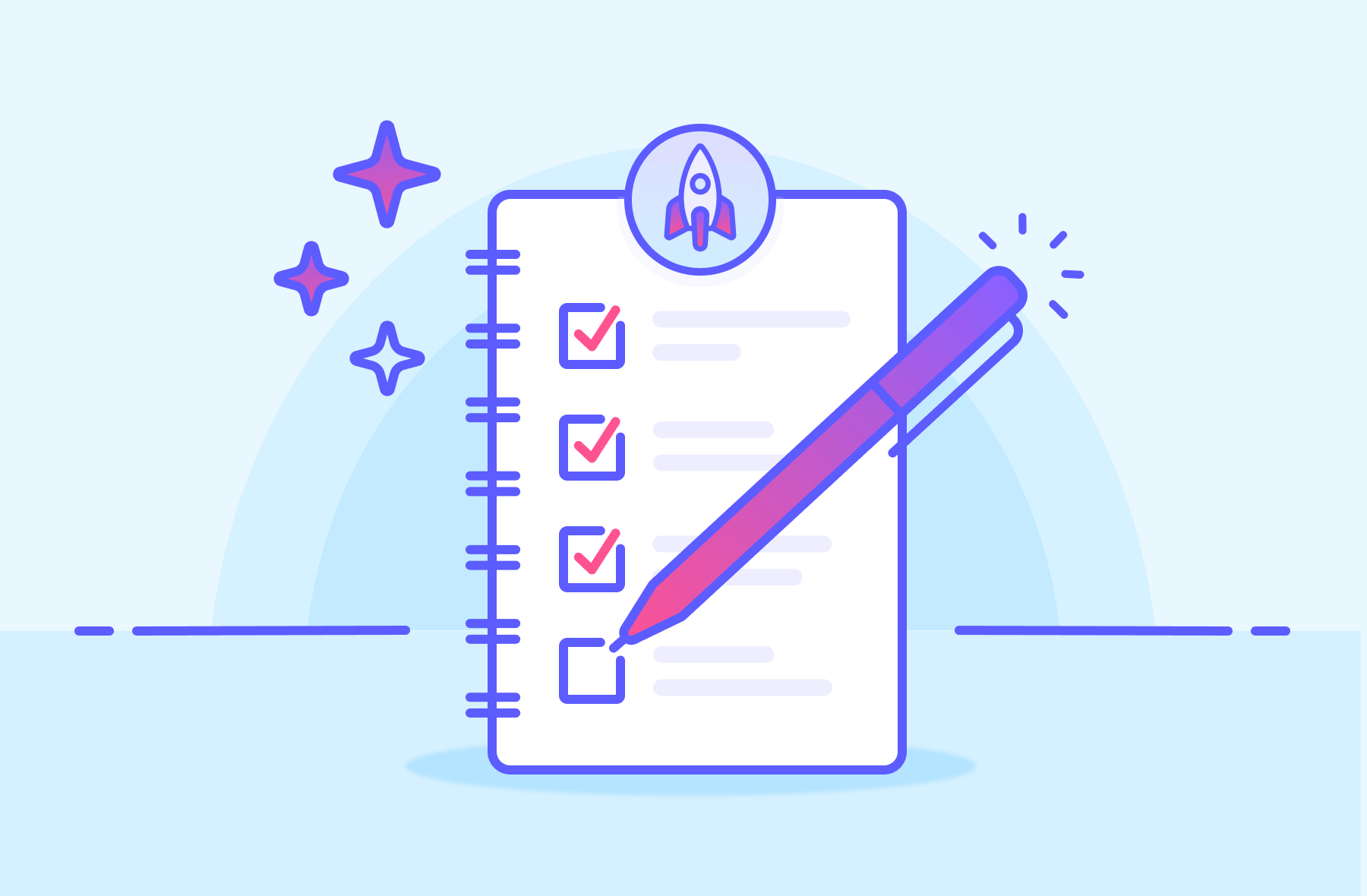
One good behavioral bridge is checklists and progress bars. When Appcues clients use this UI pattern, they see huge upticks in user engagement. Checklists tap into deep human psychology. They remind users of what we haven’t done yet, and prompt us to take those actions.
LinkedIn uses checklists really well, both in the initial user onboarding stages and in promoting users to use their deeper features. By displaying a progress bar, users visually see that they’re not done setting up the app. As they progress through the steps in the checklist, they’re guided towards additional aha moments.
- aha moment #1:I can network with people who can help me!
- aha moment #2: I’ll get more out of this site if I complete my profile!
LinkedIn’s user onboarding process extends well beyond the first time a user signs up for a product. Each subsequent time they log on, they see reminders telling them that there’s more work to be done. LinkedIn shows users how complete their profile is, and prompts them to use deeper features (like sharing content).

This was especially useful when LinkedIn began to grow from a resume collector to a social network. Around 2014, they started building out the news section of their site, and acquired LinkedIn Pulse to create business-related content. The problem was, that’s not what most users came to LinkedIn for, so the company needed a way to get people to use the feature. They wanted users to get to a third aha moment:
- aha moment #3: I can get all my professional news through this site by following people!
Tools like email and checklists helped LinkedIn get users to try out new features like following influencers and topics related to their field. They identified the behaviors they wanted people to take to become their best users (follow topics and influencers), and they made users feel like their profile wasn’t complete if they weren’t following topics.

Adroll's Modal Windows
Retargeting platform AdRoll identified a different behavior their power users were taking: integrating with MailChimp.
They found that more people with the integration spend more money in the product than those who didn’t. So AdRoll encouraged users to take this behavior by using a full-screen takeover, or modal window.
Over 80% who saw the modal activated the integration, largely because in-app messaging tends to be really powerful. Since the messages are relevant to what users are doing in that moment, they’re likely to respond well.

Integrations are a great option for later-stage aha moments. For a lot of apps, they’re complicated or auxiliary to the core function to discuss during user onboarding, and can actually confuse users at first.
If integrations aren't a core value, don't make a big deal about them in user onboarding. But in middle-stage retention stages, your job is to incorporate your product into your user’s day-to-day life, and integrations with the apps they use every day are a great way to do that.
ProdPad’s Feature Releases
Product management software ProdPad uses Appcues’ modal windows in a different way: to communicate feature releases. Since ProdPad is constantly releasing new features (1-2 per week!), they knew email wasn’t the right medium. It would feel too spammy. ProdPad needed a different way to get users to check out what’s new with the product.
They decided to use Appcues for codeless modal windows that gently guide users towards new features. The simple in-app reminder was exactly the behavioral bridge users needed.

If users are interested in the new feature, they can click through. If they don’t want to be bothered, they can quickly exit and get back to what they came there to do.
Find the User Onboarding Messaging that Works
If your users do what you ask them to the first time, congrats. You’ve got the best users in the world. But it’s not always going to be that way. In order to get users to stick around for the long haul, you need to get them to truly see the value in your product, and that takes time, and more than one aha moment.
Just like with your initial user onboarding, it’s going to take work for you to figure out what works. Playing around with UI patterns like modal windows, sliders, and checklists is the best way to find how to nudge users to middle-stage aha moments and ultimately, achieve long-term retention.