Dropbox. Slack. Evernote. Zoom. Figma. Mailchimp. Airtable. Notion. Grammarly. Typeform.
It’s not a coincidence that many of the most successful product-led SaaS companies offer a free trial or freemium plan. Users now expect to try products before purchasing—even requesting demo can feel like too high a hoop to jump through when there are self-serve options available.
But designing a successful premium product can be a real challenge. If users are getting what they want from a free product, what incentive do they have to pay? And if users are not getting what they want, what will keep them from abandoning the product altogether?
A well-designed upgrade prompt can be the key to engaging—and ultimately converting—free users into paying customers. Upgrade prompts can range from subtle reminders to paywalls that restrict actions outright—but they all need to pique the user’s interest.
Below, we’ll take a look at 3 strategies for successful upgrade prompts from popular freemium apps:
1. Limit action right in the moment
A common upgrade prompt strategy is to restrict a “premium” action right when the user clicks. This is a sensible prompt that reminds users which features are premium and which are not.
It can be a great way to build up the desire to upgrade.
Since this approach stops users from doing what they want, there’s a risk of annoying users. These are the types of prompts that active users might see several times a day. Freemium products that do this well are usually persistent, yet empathetic, with their messaging.
Spotify’s usage warning and premium feature discovery
Music streaming service Spotify allows freemium users to skip 6 songs per hour. When they exceed their limit, users are prompted to upgrade to a premium account.
Spotify does a few things well here. For one, they warn users when they are approaching their usage limit. By the time they see the upgrade prompt modal window, users have been given plenty of fair warning, which takes the sting out of a paywall.

And the mobile modal itself is cleverly written to make the upgrade prompt feel like an opportunity, rather than a restriction (“you discovered a Premium feature” feels a lot nicer than “you’re not allowed to do that until you pay us”).

Spotify’s impressive paid subscriber rates—100 million paid users as of April 2019—suggest that their approach is working.
Slack hints at more
Teams (and individuals) can use Slack for free forever, but they are discreetly prompted to upgrade when they perform a very common function in the world of communications apps: searching through messages.
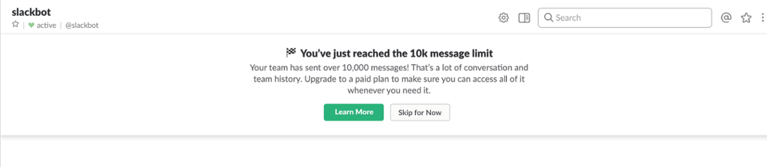
Instead of putting up a hard paywall, Slack hints that users could be getting more value from the service.

Clicking the “learn more” link leads users to the pricing page. This understated freemium upgrade prompt is a great and easy way to target users who have more urgent needs for a particular feature.
2. Nudge users with subtle reminders of value
Instead of restricting certain premium actions before they happen, some products have subtle but persistent, reminders placed throughout the product experience. When users complete an action in the free version, they are reminded of the added benefits they could access by going premium.
This strategy is great for saying “hey! did you know you can also do this?” without interrupting a user’s workflow and causing friction. Users who want to explore premium options can do so, while others can simply ignore the prompt. And because the prompt appears consistently throughout the experience, users who choose to ignore it today will know where to click when they’re ready to upgrade tomorrow.
Dropbox’s persistent prompts
Dropbox has been honing its product-led approach for years. Their persistent yet subtle upsell messaging is a great example of upgrade prompts done well.
Free users are given limited storage space. Rather than simply hitting users with an upgrade prompt when they reach their limit, Dropbox uses a persistent (but dismissible) prompt to remind users of the restrictions that come with a free plan, and offer them the opportunity to upgrade at any time.

Alternating between similar but different copy and visuals in this space is a nice touch—it subtly attracts attention from users who may have otherwise tuned out the repeating prompt without intruding on their workflow.

Get started
Deliver more leads with a freemium product experience
- By improving activation and paid conversions, the average Appcues customer lowers their customer acquisition costs (CAC) by 8%.

3. Tempt users with premium features
Sometimes users don't know they want until it's offered If your product has advanced features or functionalities that enhance the user experience, let free users know about them! Promoting these features within the context of their possible use helps users understand how your premium service could work for them.
Guide users to the moment of conversion with carrots, not sticks!
Grammarly shows off advanced capabilities
Grammar checking tool Grammarly, for example, piques users’ interest in premium features by placing them just within reach.
In the Grammarly Assistant sidebar, a small badge lets users know that the tool detected additional writing issues like misuse of passive voice, iffy word choice, or improper formatting. It’s a clever strategy—letting users know they have a problem, and making wonder how much better their writing could be if they paid for the solution.

Also in the sidebar are 2 unobtrusive feature buttons that expand into upgrade prompts when clicked—professional proofreading and plagiarism checking services. It’s a smart way to advertise premium features that users might not be aware of, and make them easy to access when regular users decide the time has come to level up their editing.

Evernote gives pro tips
Evernote uses another approach—the value-adding “pro tip.” When free users clip an article using the Chrome extension, for example, they see a message that says “clip on desktop, read on your phone.”
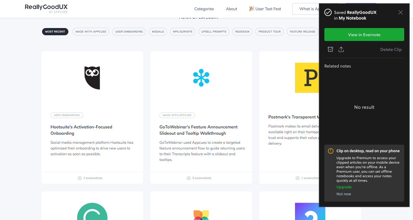
For users who can benefit from this feature, this message makes an enticing upsell prompt. For others, it comes across as a helpful, awareness-building tip. As with the other examples in this article, the key to success here is that Evernote keeps its prompt brief and unobtrusive.
Evernote does a good job of upselling outside their product as well. In the email below, they focus on a single premium feature to entice free users. The email leads with the benefits of the feature—users can clearly see how note history could positively impact their workflow—rather than a simple money grab.

Understand the user journey
Converting free users to paying customers isn’t just about creating a product that “sells itself.” Successful upgrade prompts require a solid understanding of your users and the journey they take through your product.
Timing is essential—and how you ask can be just as important as when you ask. The right moment to upsell will vary from product to product (and user to user, for that matter). But the examples above illustrate that freemium upgrade prompts work best when users feel they’re making the choice to pay because they’re enjoying your product and want to get more from it—not because you told them they have to.