The following video and blog post comes from a webinar that took place on August 30th.
If you’ve ever taken the time to watch user sessions in FullStory after you launch a new feature, you’ll notice a few common problems. And the same thing is true if you watch new users during their onboarding.
People come to us at Appcues all the time having identified that their user engagement is low. Which means users are dropping off in a huge way. And not coming back. And when we hear this, we look into the situation and realize it comes back to one of the three factors in the customer engagement framework:

Product owners didn’t sufficiently motivate their users to use their product. They didn’t educate their users on how to get the most out of their product. Or they didn’t properly activate them by getting them to the aha moment within an effective timeframe.
So we then help these people launch experiments to improve their cutomer experience. And 9 out of 10 times we find something that works.
User Onboarding Problem #1: Users Quit on Your Product Too Soon
One of the most common and painful user onboarding problems is when users quit on your product too soon. You’ll notice this while watching FullStory sessions—users are seemingly bouncing from your product after signing up.
Experiment: Motivate Users with a Welcome Message
If this is happening to you, it could be that your users are not sufficiently motivated to use your product. Motivation buys time, patience, and persistence from your users, and often that’s what it takes for people to learn a new thing.
It isn’t always obvious how and when to motivate your users, but one ripe place to do this is right after they first sign up—when they are welcomed into your product. This is most often done through a welcome message contained in a modal like this.

Welcome messages are great for reiterating your value prop and sending your new users on a mission. For more on welcome messages see here.
Casengo’s message aligns the company and product mission with that of a new user. It reminds them why they signed up and sets the expectation for what’s to come.
Experiment 2: Reduce Steps in your Onboarding Flow
Another experiment you should try if new users are dropping off s reducing the steps of your onboarding flow.
Do you know the app LINE? The one that had a huge IPO this year?
Well before LINE went public, they were seeing a serious slowing in active user growth. Looking to improve that important metric and increase their public valuation, LINE changed several aspects of their onboarding flow. Notedly, they reduced the number of steps it took to get started combining what used to be separate steps.
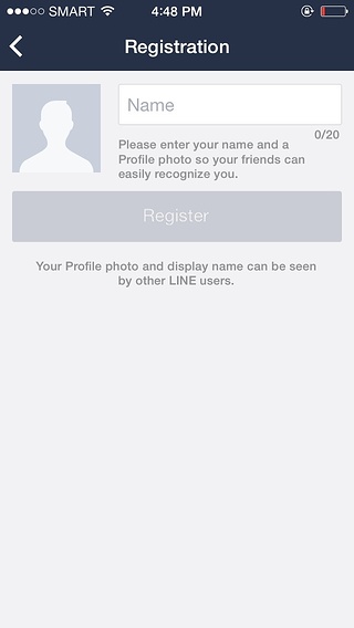

In 2014, LINE used two steps to get new users to set up their profile and add friends as shown above. In 2016, before they IPO’d, they reduced the two steps into one:

By eliminating extra steps in your onboarding flow, you can increase your activation rate significantly.
User Onboarding Problem #2: Users Aren’t Making it to Your Aha Moment
A different problem you might observe while watching FullStory is that your users aren’t getting to your Aha Moment.
Quick Sidebar: if you’re unfamiliar with the concept of an Aha Moment, it’s the moment of first value gained by a new user—the first moment where they say Aha! Now I get it. This product is awesome!
Experiment: Redirect Users towards Aha!
One experiment I suggest to help your users to the Aha Moment is to make sure you are redirecting users to the page in your product where they’ll achieve it.
Here’s an example of how we did this at Appcues and saw a crazy lift in our activation rate.

(Before)
This is a screenshot from our Mixpanel account back in June. As you can see, this graph is a funnel report of own user onboarding experience. And from what I’ve seen, the 13% signup to Aha! rate that you see here is actually pretty good.
We were doing a good job of motivating and educating our users, but we weren’t getting them to activate effectively. When we watched user onboarding sessions in FullStory, we found that most often users weren’t getting to the page where they needed to be to reach their Aha Moment.

So we launched an experiment. We redesigned our welcome message to redirect users—see above—to the page where they can get activated.
Within Appcues, that means we went to our settings step, and we decided to change what our welcome message did upon completion. We changed it from ‘just close Appcues’, which basically dropped new users on their dashboard, to redirect to a different page, which we set as so.

That simple redirection took our completion rate from 13% all the way up to about 32%, which is really good.


That means 150% more new users signing up for Appcues are finding their Aha Moment. Which means the world for our activation rate.
Experiment: Implement a Product Tour
Another way to streamline new users to Aha! is to use a product tour. Product tours can get a bad rep for being overbearing sometimes, but I’ve seen them work extremely well in rallying users in the right direction.
Our friends at Wistia use an Appcues product tour to get their new community members to engage with other video marketers in an established and meaningful way.

When new community members get warm greetings from other video marketers and subsequently explore other channels, they receive immediate value from the community and are hooked to keep coming back for more.
Feature Adoption Problem #1: Users Aren’t Finding Your New Feature
Like it or not, your customers most likely won’t find your new feature without a little help.
If you don’t believe me, watch some FullStory sessions after your next feature launch. Your customers aren’t finding your new feature without a little help.
You’re probably sending emails when you release new features in attempts to educate customers on what they can gain, but what percentage of your customers open your product release emails? And how many of those email openers take the time to fully digest the content of that email and apply what they’ve learned back next time they log into your product? When it all boils down, there aren’t many customers who get a lot of value from new feature release emails or blog posts.
Experiment: Announce New Features In-Product
Try an in-product announcement, and I guarantee you’ll see significant lift in feature adoption.
To maximize their effectiveness, you need to align how much attention your in-product announcement asks with the significance of your new feature release.
Here’s an example of a few big announcements from AdRoll. AdRoll uses Appcues to announce their biggest features inside of their their product. The AdRoll modal takes over most of their users’ dashboards—like these:
Previous


Next
Some of AdRolls feature announcements have contributed to hockey-stick like growth in feature adoption graphed in actuality here:

As you can see, adoption was flat after they sent a few emails out and let people find the feature organically. But when they published their Appcues modal, things really took off and drove north in an amazing way.
Experiment: Use Less Intrusive UI Patterns for Less Important Features
Now for less important features, you may want to try a less-invasive ui pattern—one that doesn’t take up your users’ full screen and require them to read and click through several steps.

For that Appcues offers other less invasive UI patterns such as:
- Slideouts—little boxes that slide from different parts of your screen
- Hotspots—blinking beacons that call attention to certain areas of your product. You click on those and they’ll open with a message
- Tooltips—sequential call out boxes that point to isolated elements in your product and can be used for a variety of purposes
All of these patterns do well for small or medium-size feature releases.

And as you can see in this example from ProdPad, this Slideout takes up enough space to be noticed and read, but they can easily be navigated around.
And for another example, Facebook uses Tooltips to announce platform enhancements. And I bet you’ve seen a few of these:

Feature Adoption Problem #2: Users Can’t Figure Out the Feature
Last but not least. Getting new users to the page where your new feature exists usually isn’t enough to get them to activate or adopt the feature.
Experiment: Educate Users with a Product Tour
Consider educating your users how to engage with the feature, and how it might connect with the Aha Moment and other modules of your platform.
The way I like to create feature tutorials is to imagine a traditional account manager demoing the tool over and over to a customer. I then replace her most important points with a few tooltips. And this is super simple in Appcues.